
The EU Cohesion Policy projects in Italy - first card
Some weeks ago, my colleagues and friends at onData invited me to participate to AwareEU, a EU-funded project aimed at raising awareness, within the scope of Italy, about the Cohesion Policy of the EU, a container of funds the Union gives out to its regions to support development, growth and of course to promote levelling up.
So I was asked to create data cards on EU Cohesion projects funded in Italy for specific themes (and also to give a workshop to explain how I generate my cards, the workshop being aimed at journalists interested in upskilling in data journalism). There is a portal, Open Coesione, where data is available both via API and in the form of data dumps, a rare occurrence of open data actually accessible in my country - you can check out the onData newsletter for more on this theme, we advocate for the correct generation and use of open data and its standards.
This one below is the first card I’ve realised - it’s in Italian but I will of course explain it to be accessible more generally.
The card
Cohesion funds are delivered in 7-year cycles, I’ve chosen to focus on cycle 2014-2020 as it’s the latest finished one at the time of writing. I’ve also chosen the theme “Ambiente” (Environment), and I ended up with a total of about 9100 projects overall.
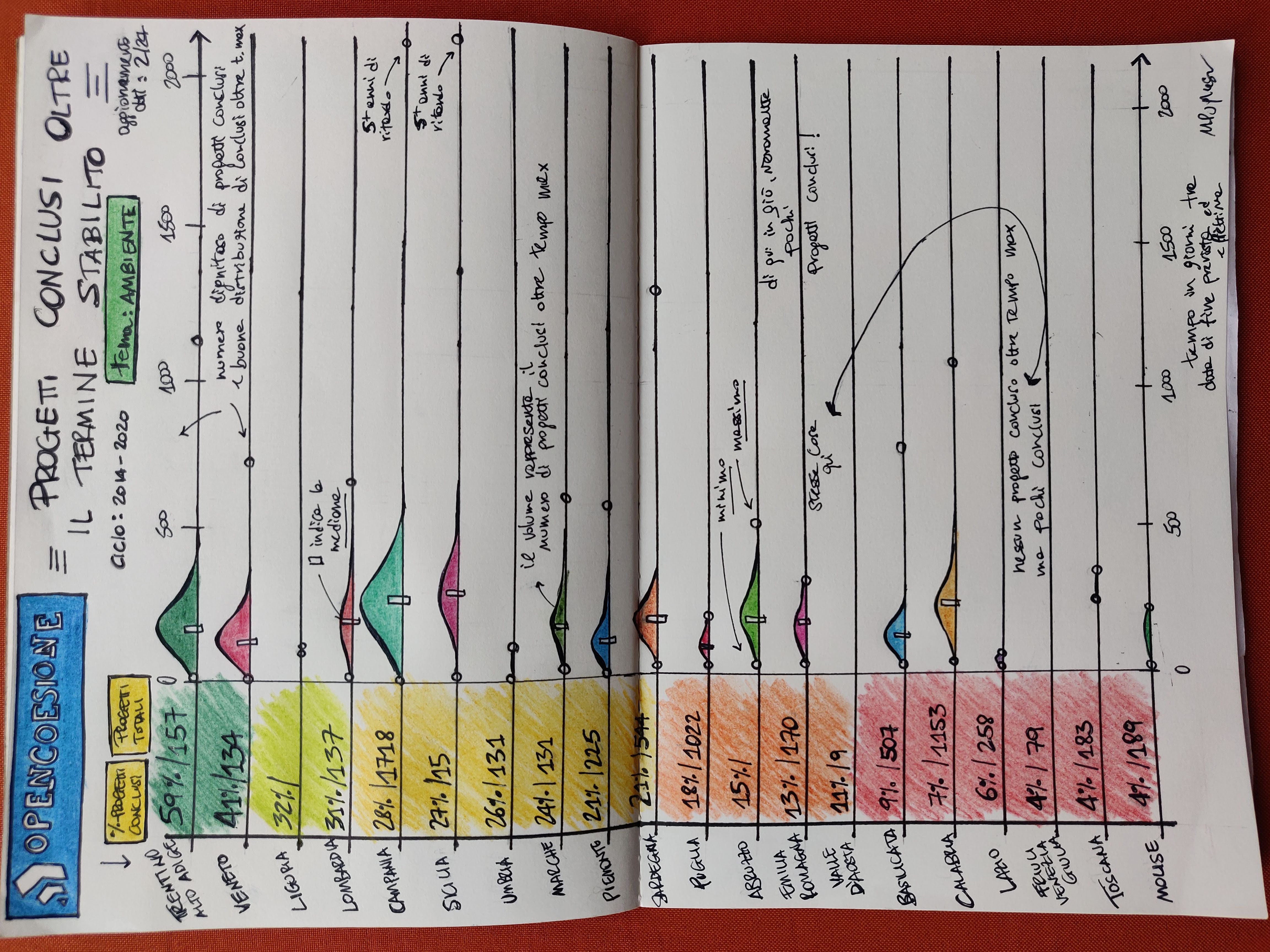
The viz represents the 20 regions of Italy, ranked by the proportion of total projects which are concluded, so you see Trentino-Alto Adige at the top with 59% and Molise at the bottom with 4%. I’ve used a CSV dump of the data (it was just more convenient than using the API for my goals here), which reports an update date of 29 Feb. 2024. The leftside bar simply illustrates this ranking colour-coded and reports the total count of projects too - which shows that, e.g. Valle d’Aosta (the smallest of regions, by surface), may have a poor 4% in completion rate, but it also has just 9 projects.
Aside from this ranking, the core of the viz are the distributions, which are derived considering solely the projects completed after the expected date. So while on the left side you see counts and percentages related to the total projects by region, the distributions refer only to those projects, within the total, which have been completed with a delay. The distribution for each region is in reality histogram: volumes give an idea of how many projects are there.
On a general basis southern regions have more projects overall, and also (likely consequently) more projects with a conclusion date beyond expectation: this has to be an effect of the fact that this part of the country is poorer and generally less developed, hence it is expected that it will receive more investments form programs like this.
There’s been some minimal data cleansing needed to get to this (mostly dates in the future or filled in with the standard 1/1/1970 timestamp), but really the dataset is pretty good and workable, to the point that I was able to use ChatGPT too to do some simple measurements. You can check my notebook (linked below) for details! As an important remark, I’ve only considered projects related to a single and only region, as there are many which either span multiple regions or the whole country.
I’ve added some text here and there to highlight some of the most interesting results, e.g. two regions (Friuli Venezia Giulia and Valle d’Aosta) have no exceeding-time projects; Campania and Sicily have a project delivered more than 5 years after the expectation and some regions (e.g. Lazio, Toscana) have very few exceeding-time projects. The small rectangle within the histogram is the median, arguably the most interesting indicator for comparisons. Also, little circles indicate the minimum and the maximum.
There will be more cards on this topic, stay tuned! As always, feedback is more than welcome :).
References
- My notebook on this work
- Workshop slides
- onData newsletter
Liked this? I have a newsletter if you want to get stuff like this, and more in your inbox. It’s free.