
Viral families and viral species, a data card
This post has been slightly edited in time, so that the text is longer than the original version. The data in the card still refers to November 2020 though.
Viruses are biological marvels: so tiny, so sly. They are typically an order of magnitude smaller than bacteria and they’re the most common organisms on the planet. I’ve been looking at how they cluster up in families and how many there are.
The data card
I did this card in November 2020 using the latest taxonomy available then (see the data section below), so it excludes the infamous SARS-CoV-2. However, it contains SARS-CoV, the Coronavirus responsible for the outbreak of 2003, which had a higher fatality rate but was way less contagious than it “successor”.
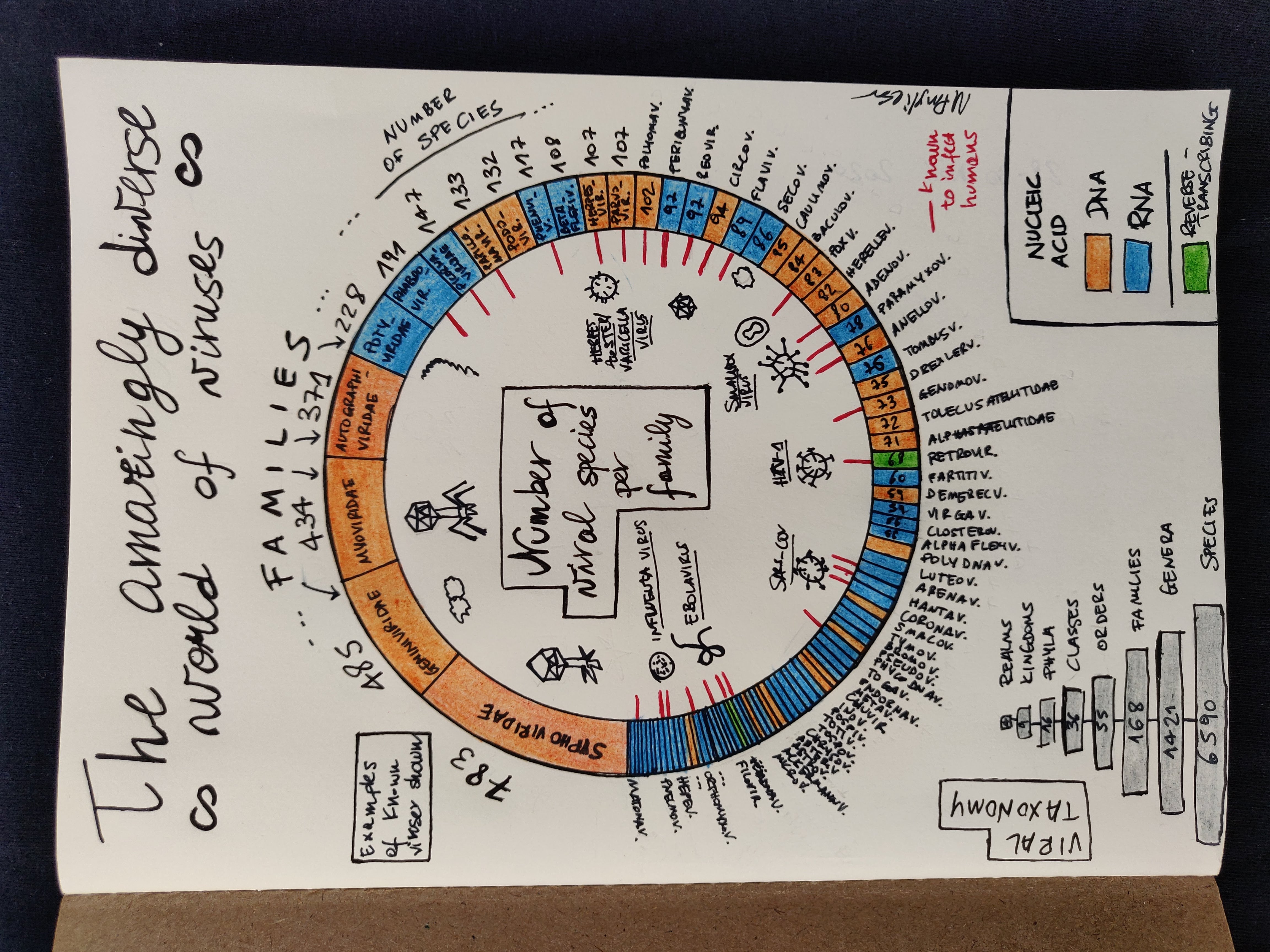
The viz is a donut chart, showing the count of viral species per family. It uses the ICTV viral taxonomy (see below on details about this choice).
On the bottom left, you see how the taxonomy works: we go from species up to realms; I’ve chosen to display families as it was the sweet spot where you’d have enough variety for a good visualisation but not too much that it would make any chart unreadable. Families are sorted by the count of species within - note that with 168 families I couldn’t write the names of each on the chart. Colour indicates the type of nucleic acid (the Retroviridae family, to which HIV belongs, which uses reverse transcriptase is in green) and a red sign marks whether the family is known to infect humans. I’ve sketched some of the most “famous” viruses as examples: you see there’s Filoviruses (Ebolavirus belongs here) which as the name suggests look like strings, the spikey shapes of Coronaviruses, Orthomyxoviridae (Influenza is one of them), and so on.
So, what do we learn?
That there’s a lot of viruses! The most populated families are DNA-based and they do not infect humans:
- Siphoviridae and Myoviridae, which infect bacteria and archaea - these have amazing shapes, see here
- Geminiviridae, which infect plants
- Autographiviridae, which infect bacteria
Rhabdoviridae is the first family (by count of species) known to infect humans, it includes rabies.
😅 This is the type of data card which took me a good chunk of time, but I’ve learned a lot and it was good fun.
The data
Gathering it
I needed counts of viruses based on some biological classification, so I’ve started by looking for a taxonomy of all viruses known (I’m no biologist). I’ve discovered there are at least two ways in which viruses get taxonomically classified: the one produced and maintained by the ICTV (International Committee on Taxonomy of Viruses) and the Baltimore classification, named after his creator, biologist David Baltimore. The first is organised on a variety of features and updated regularly, the second divides viruses based on on their main characteristics (such as their nucleic acid).
I had initially figured I’d visualise the Baltimore classification but then I thought that the ICTV one was more apt to be shown in a viz - the data is more segmented and (to my understanding) there is less ambiguity. I found the data easily available on the ICTV website. This paper on PLOS Biology is for those of you who want to really know more about viral classification (PLOS is open-access).
I’ve used the 2019 review (the latest one available when I did this card), so it excludes SARS-CoV-2. In this review there are 6590 species grouped into 168 families. Note that data can update quite dramatically, it looks like in 2020 alone the ICTV added more than 1000 species to its taxonomy.
I used this page on ViralZone (a resource created and maintained by the Swiss Institute of Bioinformatics) to cross-check whether a family is known to infect humans and in that case, the nucleic acid classification. For the viruses not infecting humans - the vast majority - I’ve had to retrieve their nucleic acid categorisation via a combination of Wikipedia and (when not there) general googling. This was by far the step that took the longest, especially because there are some ambiguities across sources.
Some notes on drawing this data
I thought a donut chart would do for this type of data, given the number of data points and their distribution: the 168 families go from 783 member species in the most populated one to a bushy tail with very low counts of species.
The choice of blue and orange for the nucleic acid was dictated by the need to choose two visibly separated hues, plus it is a coupling I find pleasing to the eye. For the additional info I was keen to add (family infects human or not), a red mark was a simple choice as it made it quite evident. To make it all more appealing, I’ve drawn a few representatives of better-known families, for their different shapes.
Bring-along items
I just have a book to recommend on this topic, and it is an actually quite well-known one so chances are you may have already read it. For those of you who still haven’t, Spillover by D Quammen is a great read. It came out in 2012 and no doubt it must have had a good surge in sales during the COVID-19 pandemic. Before reading it I thought it would be a scipop presentation of what’s a spillover (the ecological process whereby a pathogen jumps from a host species to a nnew one), but in fact it works more as a narration of chronological events.
Quammen is a writer who produced several books on scientific topics, lately focusing on pathogens and their ecology. In “Spillover” (ominously sub-titled “Animal infections and the next human pandemic”), he analyses several occurrences of the phenomenon via interviews with protagonists and accounts from the field. I guess it became so popular during the latest pandemic exactly because he talks about how the world we are building, with all the issues due to climate change, loss of biodiversity, unsustainable market demands is creating situations where spillovers can become more likely.
He writes very well, and the material is well researched so it’s really an excellent use of time. On my list I got now his latest book, “Breathless: The Scientific Race to Defeat a Deadly Virus”, where he focussed on the race to get a vaccine against SARS-COV-2.
References
- G Kaiser, Microbiology, section “Size and shapes of viruses” on Biology LibreTexts
- T Oliver, The human virome: The trillions of viruses inside your body keeping you alive, BBC Science Focus, 2021
- H Zhou, A Review of SARS-CoV2: Compared With SARS-CoV and MERS-CoV, Front. Med. 8, 2021
- P Simmonds et al, Four principles to establish a universal virus taxonomy, PLoS Biol 21(2), 2023
- A Dance, The incredible diversity of viruses, Nature 595, 7865, 2021
- Viruses infecting humans, on ViralZone
- A useful animation about the relative size of organisms, from the Genetic Science Learning Center at the University of Utah
- My “quick ‘n dirty” Jupyter notebook where I derived the counts from the ICTV data
Oh, I have a newsletter (see link in navigation above), powered by Buttondown, if you want to get things like this and more in your inbox you can subscribe from here, entering your email. It’s free.