Jekyll2024-07-21T18:25:18+01:00https://martinapugliese.github.io/feed.xmlClearly ErroneousTech, data and 1000s wonderful thingsMartina PuglieseOpenCoesione, progetti conclusi e costi2024-07-21T00:00:00+01:002024-07-21T00:00:00+01:00https://martinapugliese.github.io/data/opencoesione-bubblesQuesta è la seconda della serie di data cards (visualizzazioni delle mie fatte a mano) che sto facendo per il progetto AwareEU assieme agli amici di Ondata. Il mio contributo mira a realizzare visualizzazioni sui dati di OpenCoesione, il portale istituzionale italiano che raccoglie e rende accessibili i dati sui progetti di coesione dell’Unione Europea, ovvero quei fondi mirati a livellare economia e welfare delle regioni europee. Nella prima viz mi sono occupata dei progetti a tema ambiente del ciclo 2014-2020 (l’ultimo concluso, ad oggi) e sono andata a guardare, per ciascuna regione italiana, la percentuale di progetti completati e la distribuzione di ritardi per quelli conclusi oltre il tempo previsto.
Qui ho considerato ancora lo stesso ciclo, 2014-2020, e i progetti per i temi “ambiente” e “inclusione sociale e salute”. Ho seguito la stessa procedura in termini di raccolta dati, vale a dire ho scaricato e usato i CSV compilati da OpenCoesione. Nella viz dell’altra volta ho spiegato brevemente come la piattaforma presenta i dati.
La data card
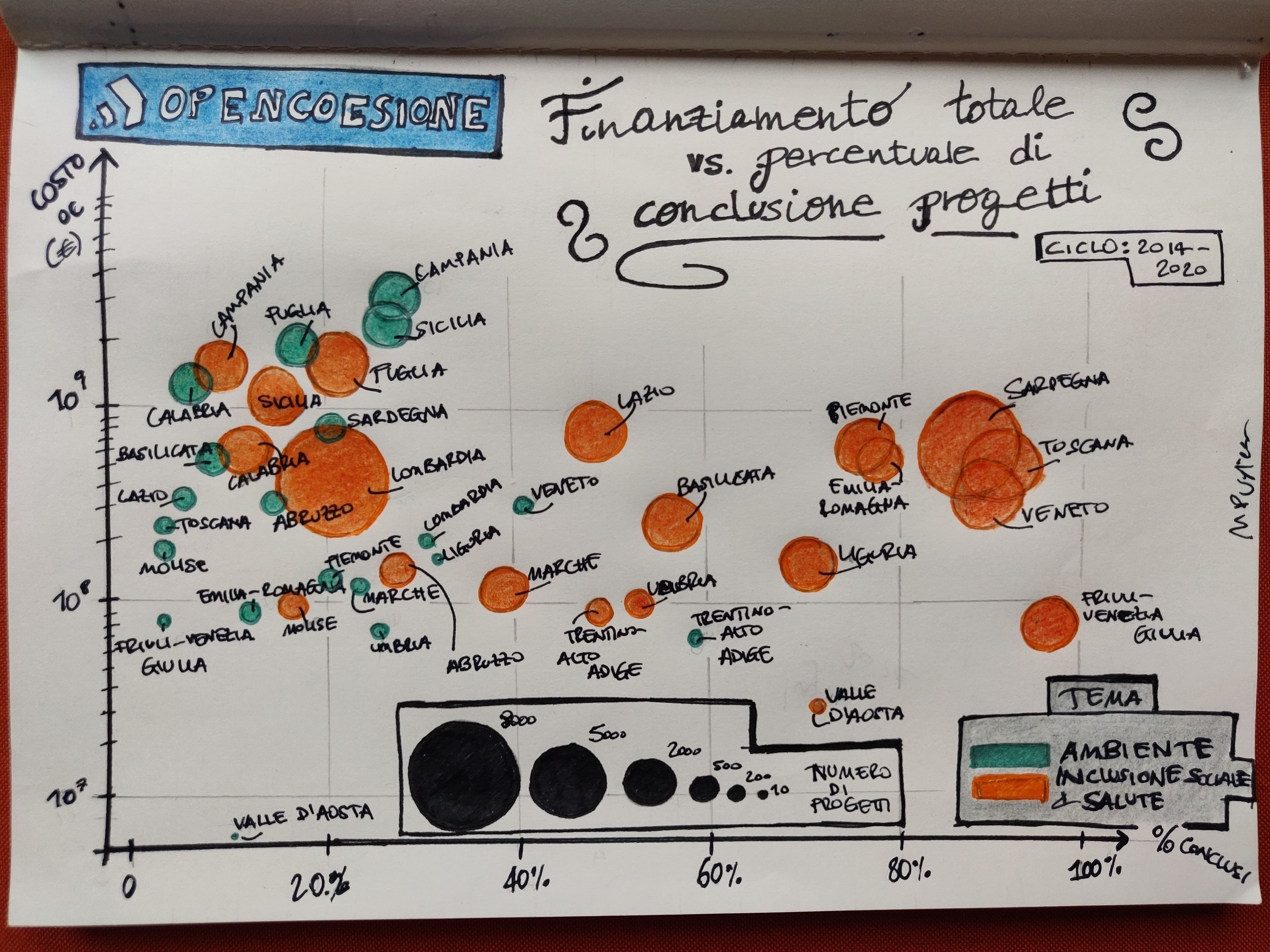
La viz è un grafico piuttosto classico, un “bubble plot”. Per le due serie di dati, cioè i due temi, ho aggregato i dati per regione. Su x ho messo la percentuale di progetti conclusi (ad oggi) e su y il finanziamento totale dalle politiche di coesione. Ogni regione è una bolla di taglia pari al numero di progetti finanziati in totale per quel tema.
Progetti delle politiche di coesione UE a tema ambiente e inclusione sociale/salute per le regioni italiane, il grafico riporta il costo complessivo dei progetti e la percentuale di completamento, e le bolle (una per regione) hanno grandezza proporzionale al numero di progetti, indicato orientativamente dalla legenda in basso.
Nota: per il tema ambiente i dati sull’asse x sono esattamente quelli con cui ho ordinato le regioni nella scorsa viz.
Quello che si nota immediatamente è che i progetti di inclusione sociale/salute sono generalmente più copiosi: le bolle sono più grosse di quelle del tema ambiente. Tendono anche a venire conclusi in percentuali più alte, infatti le bolle arancioni sono spostate tendenzialmente più a destra rispetto a quelle verdi, e ci sono diverse regioni con percentuali molto alte.
Inoltre, mentre nel caso delle bolle verdi le regioni del Sud hanno chiaramente più progetti (sono le più grosse, Campania e Sicilia in particolare hanno il maggior numero di progetti, più di 1500 ciascuna), nel caso di quelle arancioni la differenza Nord-Sud non si vede, abbiamo infatti la Lombardia in cima con più di 8000 progetti, seguita dalla Sardegna con più di 7000, e poi a seguire le altre. Per questo tema ci si aspetterebbe una certa correlazione con la taglia della popolazione della regione (popolazione maggiore implicherebbe intuitivamente un maggior numero di progetti di stampo sociale), che non sembra vedersi però (ci sarà, ma debole). Chiaramente non è solo la taglia di una popolazione che determina la necessità di aiuti finanziari, ci sono complessi fattori economici e sociali in interazione.
Il numero di progetti va appunto dai circa 8000 della Lombardia per inclusione sociale/salute ai circa 10 della Valle d’Aosta per ambiente.
Per quanto riguarda i costi finanziati, prima di tutto notiamo che l’asse y porta i dati in scala logaritmica, cioè spaziati di ordine di grandezza e non linearmente, il che significa che graficamente la distanza tra 10 e 100 è la stessa che tra 100 e 1000, per esempio. La scelta è un artificio grafico, serve a due cose:
riuscire a rappresentare agevolmente dati che spaziano di molto tra minimo e massimo,
riuscire a vedere meglio le differenze tra quei punti che si accavallano nella stessa zona, per esempio tutte le regioni attorno a \(10^8\) (100 milioni), che in scala lineare apparirebbero troppo vicini per essere distinti.
Il grosso delle regioni sta nella banda tra i 100 milioni (\(10^8\)) e il miliardo (\(10^9\)). Notiamo la Valle d’Aosta (la regione più piccola) con il finanziamento meno sostanzioso di tutte per entrambi i temi (e anche il minor numero di progetti).
Tra parentesi, ho cercato di scegliere i colori dei due temi in modo da creare un facile rimando mentale - non mi andava di usare la classica combinazione rosso/blu perché spesso si usa per differenze politiche. Ovviamente per “ambiente” è immediato scegliere il verde; per l’altro tema, non essendo così evocativo di un particolare colore, la scelta è caduta su uno che creasse una differenza ben visibile.
Spero questo post vi sia piaciuto e vi abbia detto qualcosa che non sapevate. Condivido queste visualizzazioni, di solito su temi leggeri e principalmente in inglese, nella mia newsletter, ci si può iscrivere qui:
]]>Martina PuglieseNotes on ChatGPT and learning a language2024-07-07T00:00:00+01:002024-07-07T00:00:00+01:00https://martinapugliese.github.io/chagpt-languageYou can definitely use generative AI to support your language-learning, it’s a great use case. Note: I didn’t say learn - there’s a plethora of posts/blogs/videos on how modern AI can make you learn a language so you can ditch your teacher and those old fashioned books, etc. I personally don’t believe it for a second but I don’t wanna get into that right now, maybe in another post, and maybe we can look at some literature about it too (and, I can ask some linguist friends)!
Here’s just a few tips I have from own experience, as I’m learning German and I’ve incorporated ChatGPT into my routine as part of many other activities and tools I use. Most of my learning is self-driven (as autodidact), but I also took a module of a course, in-person, and I’m currently taking conversational lessons. I will continue with these traditional means because I find them fun, as I study languages purely as a divertissement and because it’s a good brain exercise.
The below is mostly about ChatGPT (in the GPT 4o flavour), but some things are translatable to other LLMs. With the speed at which LLMs are improving in capabilities, acquiring new features and just getting added (not always productively) to tools this post will likely age really badly in just a few months weeks!
Vocabulary
Asking it to come up with a list of e.g. “verbs that start with ‘v’” gives me material that I can write down, or just lets me test my own knowledge. You can use it as a game, you can ask it to test you, and it’s quite good fun. It unsurprisingly gets repetitive quite quickly though, so I find it a great way to stimulate your own creativity in thinking about what you want, self-testing yourself, try up different prompts.
I use AnkiApp for flashcards. It has just shipped a new feature that lets you use AI to quickly generate them (from a picture, handwritten notes, etc). It’s my new favourite thing as it saves me sooo much time.
Chatting
Voice mode in GPT 4o is pretty good, and yes you can have a conversation with it - e.g. about a movie, some historical facts, biographies etc.
It detects the language you use pretty well - I’ve stress-tested it with talking in two different languages within the same chat and it understood what I was doing (“I see you know another language …”).
Note: when talking back it uses an (American) English accent regardless of the language (arguably you’d notice that more in some languages than in others). Many people have noticed this too (1, 2) - it’s to do with the fact that its TTS (text-to-speech) model will have been trained on way more material in English than in other tongues, and, arguably, also with the cultural dominance of English (it’s an American company, it will be interesting to see how this develops with other AI players).
I wouldn’t trust it for pronunciation tbh, but it may depend on the language. Anecdotally, I find its pronunciation of Italian quite heavily English-accented, so yeh, not great for now.
Voice mode is only available in the mobile app, not the web (there’s plugins though, I think).
About other LLMs, Claude doesn’t have voice moce AFAIK. Gemini does and it works well but you need to specify the list of languages you want to use in the settings - it interestingly does not seem to detect a language automatically, leading to some funny situations (3), which I’ve seen too.
It’s fun and interesting to compare what you get from different LLMs with the same prompt.
Grammar
I don’t really GenAI it to teach me about grammar because I have plenty of resources and/or good ol’ human researching is good for me, but you can. I’d be cautious as for everything in regards to what it tells you, but I’m sure it can be useful.
I use it a lot to give me exercises on a specific topic though, once I know about it. For instance, if I want to train my knowledge/memory of adjective endings, a very simple prompt would do, and I get a list of sentence to fill in, and it will correct me for what I do. Again, it tends to get repetitive quickly, but it’s good enough to save me time from searching the Internet for specific exercises.
]]>Martina PuglieseThe EU Cohesion Policy projects in Italy - first card2024-06-30T00:00:00+01:002024-06-30T00:00:00+01:00https://martinapugliese.github.io/data/opencoesione-delaysSome weeks ago, my colleagues and friends at onData invited me to participate to AwareEU, a EU-funded project aimed at raising awareness, within the scope of Italy, about the Cohesion Policy of the EU, a container of funds the Union gives out to its regions to support development, growth and of course to promote levelling up.
So I was asked to create data cards on EU Cohesion projects funded in Italy for specific themes (and also to give a workshop to explain how I generate my cards, the workshop being aimed at journalists interested in upskilling in data journalism). There is a portal, Open Coesione, where data is available both via API and in the form of data dumps, a rare occurrence of open data actually accessible in my country - you can check out the onData newsletter for more on this theme, we advocate for the correct generation and use of open data and its standards.
This one below is the first card I’ve realised - it’s in Italian but I will of course explain it to be accessible more generally.
The card
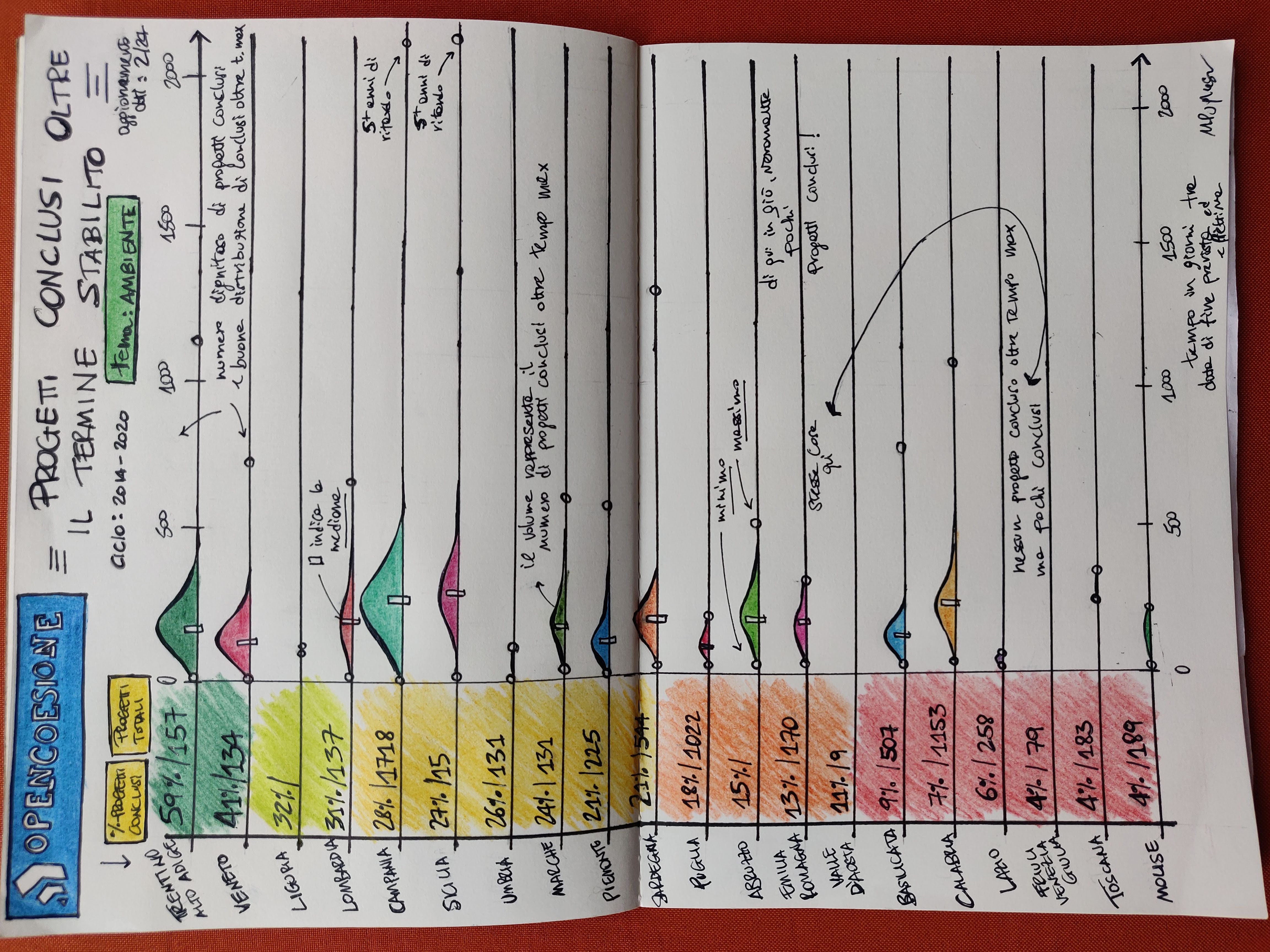
Cohesion funds are delivered in 7-year cycles, I’ve chosen to focus on cycle 2014-2020 as it’s the latest finished one at the time of writing. I’ve also chosen the theme “Ambiente” (Environment), and I ended up with a total of about 9100 projects overall.
First viz I did for AwareEU: region by region (Italy), distributions (really: histograms) of the time in days between predicted and effective date of delivery of each project, considering only projects that were concluded after the predicted date. On the left side, count of projects overall and relative percentage of concluded ones.
The viz represents the 20 regions of Italy, ranked by the proportion of total projects which are concluded, so you see Trentino-Alto Adige at the top with 59% and Molise at the bottom with 4%. I’ve used a CSV dump of the data (it was just more convenient than using the API for my goals here), which reports an update date of 29 Feb. 2024.
The leftside bar simply illustrates this ranking colour-coded and reports the total count of projects too - which shows that, e.g. Valle d’Aosta (the smallest of regions, by surface), may have a poor 4% in completion rate, but it also has just 9 projects.
Aside from this ranking, the core of the viz are the distributions, which are derived considering solely the projects completed after the expected date. So while on the left side you see counts and percentages related to the total projects by region, the distributions refer only to those projects, within the total, which have been completed with a delay. The distribution for each region is in reality histogram: volumes give an idea of how many projects are there.
On a general basis southern regions have more projects overall, and also (likely consequently) more projects with a conclusion date beyond expectation: this has to be an effect of the fact that this part of the country is poorer and generally less developed, hence it is expected that it will receive more investments form programs like this.
There’s been some minimal data cleansing needed to get to this (mostly dates in the future or filled in with the standard 1/1/1970 timestamp), but really the dataset is pretty good and workable, to the point that I was able to use ChatGPT too to do some simple measurements. You can check my notebook (linked below) for details! As an important remark, I’ve only considered projects related to a single and only region, as there are many which either span multiple regions or the whole country.
I’ve added some text here and there to highlight some of the most interesting results, e.g. two regions (Friuli Venezia Giulia and Valle d’Aosta) have no exceeding-time projects; Campania and Sicily have a project delivered more than 5 years after the expectation and some regions (e.g. Lazio, Toscana) have very few exceeding-time projects. The small rectangle within the histogram is the median, arguably the most interesting indicator for comparisons. Also, little circles indicate the minimum and the maximum.
There will be more cards on this topic, stay tuned! As always, feedback is more than welcome :).
Liked this? I have a newsletter if you want to get stuff like this, and more in your inbox. It’s free.
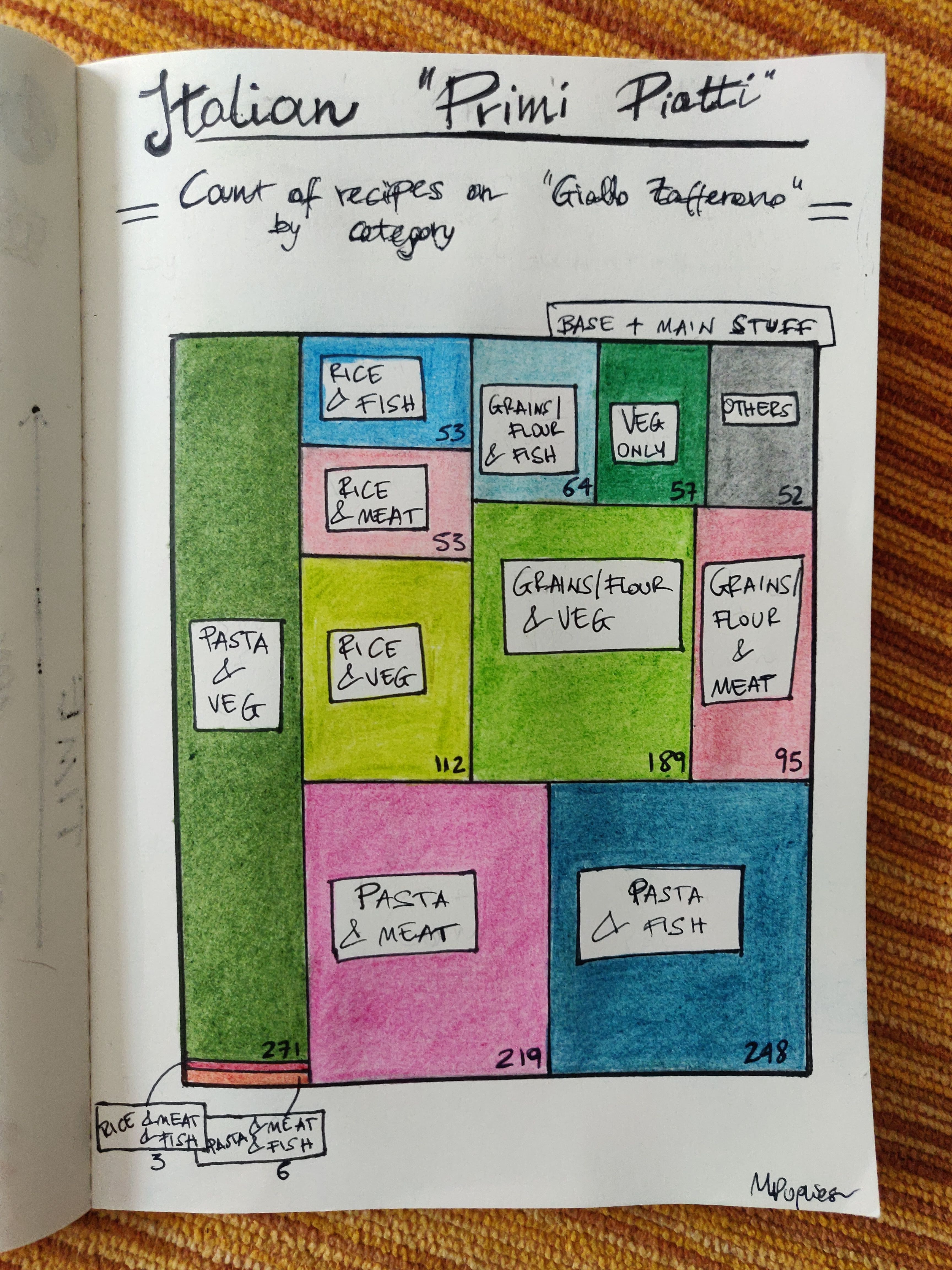
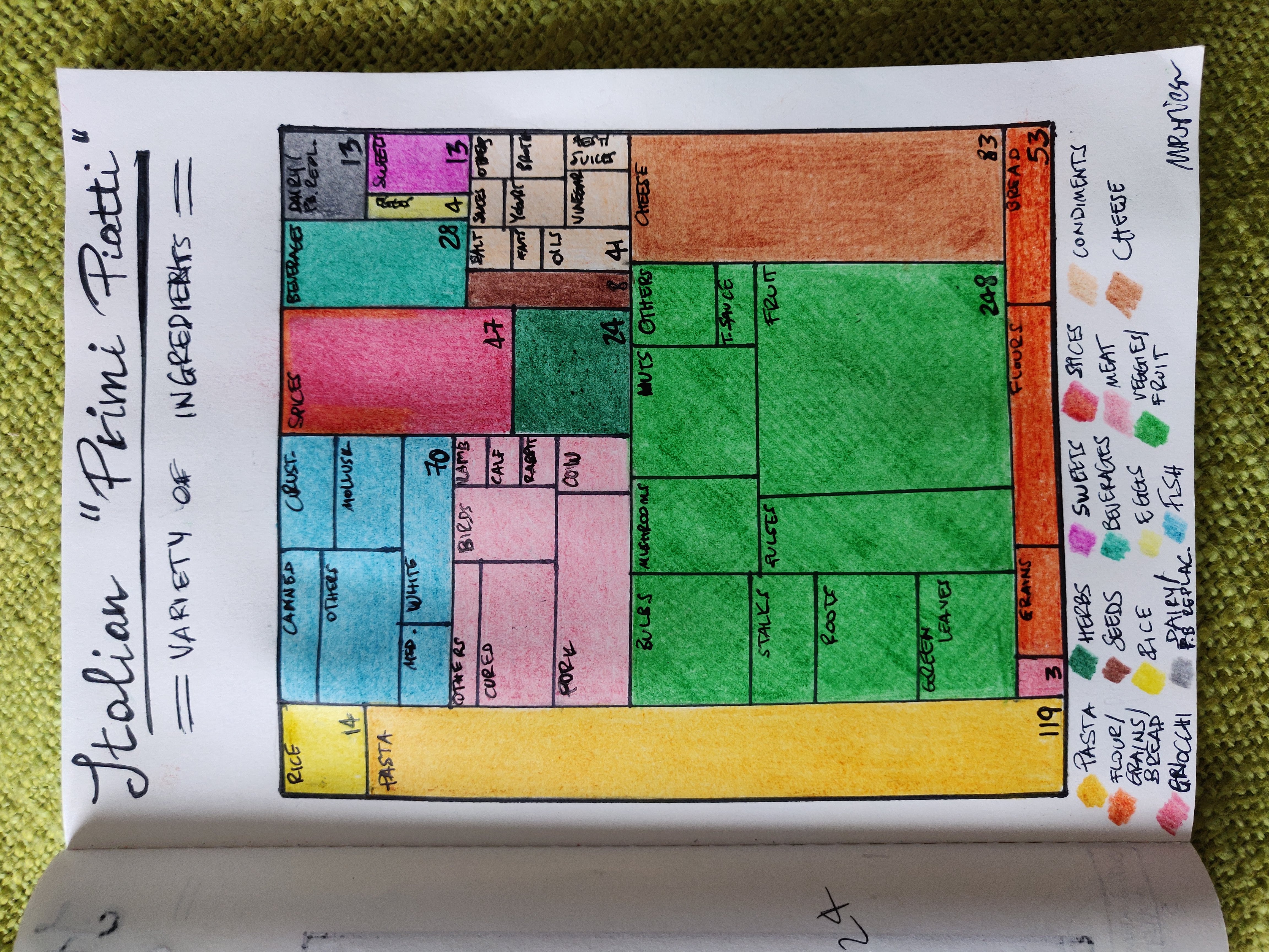
]]>Martina PuglieseItalian main dishes round 2 - combinations2024-05-04T00:00:00+01:002024-05-04T00:00:00+01:00https://martinapugliese.github.io/data/gf-pastaAs a follow-up to my latest data card on Italian food, I’ve used the same data to create a new viz, still focusing on “primi piatti” (main dishes) but this time looking at combinations of ingredients rather than single ones. In the previous work I had used a treemap to represent the share of recipes from a famous Italian food site (Giallo Zafferano) by type of ingredient - the types had been generated by a trial-and-error process consisting of getting help from ChatGPT in grouping ingredients and iteratively checking/adjusting.
Here, I compute the share of recipes by combinations of categories of ingredients, and I still use a treemap (I’ve been playing around with this type of representation).
Combinations are considered as between one base ingredient and one (or more) core ones. By base ingredient I mean either of:
pasta
rice
Grains (other than rice), flour or gnocchi
Core ingredients, on the other hand, are:
meat
fish
vegetables
A typical dish is composed of a base and a core ingredient. Note that a dish with e.g. pasta and meat or pasta and fish will most likely contain vegetables too, but in those case it’s the meat/fish that determies the classification; dishes with pasta/rice + veg do not contain meat or fish. As per last time, the “flour” ones are dishes where you e.g make pasta from scratch.
The combos are decided by me upfront, and everything that doesn’t fit them goes into a “other” category - these are recipes about making pasta only (so, incomplete dishes) or pasta/rice with only cheese, oil or spices, it’s a minority. There is also a category for “veg only” dishes, think mostly soups (they can contain meat too, in small proportion). Rarely, you have dishes with both meat and fish - examples below.
From the ingredients obtained for the previous card, I’ve just been counting how often each of the combos appears in the dataset, which is up-to-date as of end of March 2024, so this was an
Combinations of Italian main dishes by base and core ingredients as a treemap, data from Giallo Zafferano. Counts at the bottom show the number of recipes
For details on the data, how I’ve extracted and maquillaged it head to my previous post.
By the way, I’ve realised that last time I forgot to mention that I’ve had Python generate the treemap, which I’ve copied on paper - I didn’t do the areas calculations for rectangles myself, just for speed and to avoid making mistakes. It was the same procedure for this card.
I will definitely use this same data for some other cards, so stay tuned!
Liked this? I have a newsletter if you want to get stuff like this, and more in your inbox. It’s free.
]]>Martina PuglieseThe ingredients of Italian main dishes2024-03-30T00:00:00+00:002024-03-30T00:00:00+00:00https://martinapugliese.github.io/data/italian-ingredientsThe original idea
Food is a favourite theme for my data cards. I originally wanted to compare Italian and Spanish typical food, with the hypothesis that the second is much more varied in ingredients and styles, the idea being that Spain has been a major empire so it must have imported flavours and methods from many parts of the world, building a rich culinary repertoire. This is certainly the feel I get from what I know of Spanish food, totally based on experience and likely confirmation bias.
I was looking for data that would prove or disprove this but I didn’t have much luck as I needed reliable, vast and respectable sources that also happened to be accessible in machine-readable format.
My first goal was building a list of ingredients with their prevalence, for both Italian and Spanish food. I initially thought I’d query the Internet Archive for books and magazines that could represent the two cuisines well. Usually you can find OCR’d text - from there it would have been a case of parsing the texts to isolate and count all ingredients. I thought I’d do some googling and ChatGPT-asking to first choose a list of reputable sources to look for, as I needed books and magazines focussed on national food, not stuff that could contain fusion/foreign influence. This is a slippery slope per se because what is “national” food anyway? Where does “tradition” end to branch into “global” or “modern”? Where would one put the divide as to what’s genuinely representative of a national cuisine and what’s not, and why? These are deep questions that transcend the scope of my little exploration and also, that would require a deep dive into the sociology and anthropology of food.
The attempt didn’t work anyway, because the Internet Archive doesn’t have - in a digitised form - any of the books or magazines that my googling and ChatGPT’ing suggested, and that the human that is me then vetted to gauge as to whether they could be good sources. I found a bunch of editions of an Italian famous magazine, quite fit for purpose, but no Spanish equivalent. I found good books but not digitised/available.
And so, this is how I decided to focus solely on Italian food instead, scaling down to a simpler project. I know good sources of Italian food material.
The data
I decided to then lean on an institution of Italian recipes, the website Giallo Zafferano (note: it exists as an English version too). It is so authoritative that it has a Wikipedia page. The choice was also motivated by open source code that would allow me to quickly scrape all recipes, so I didn’t have to do it myself - this one1.
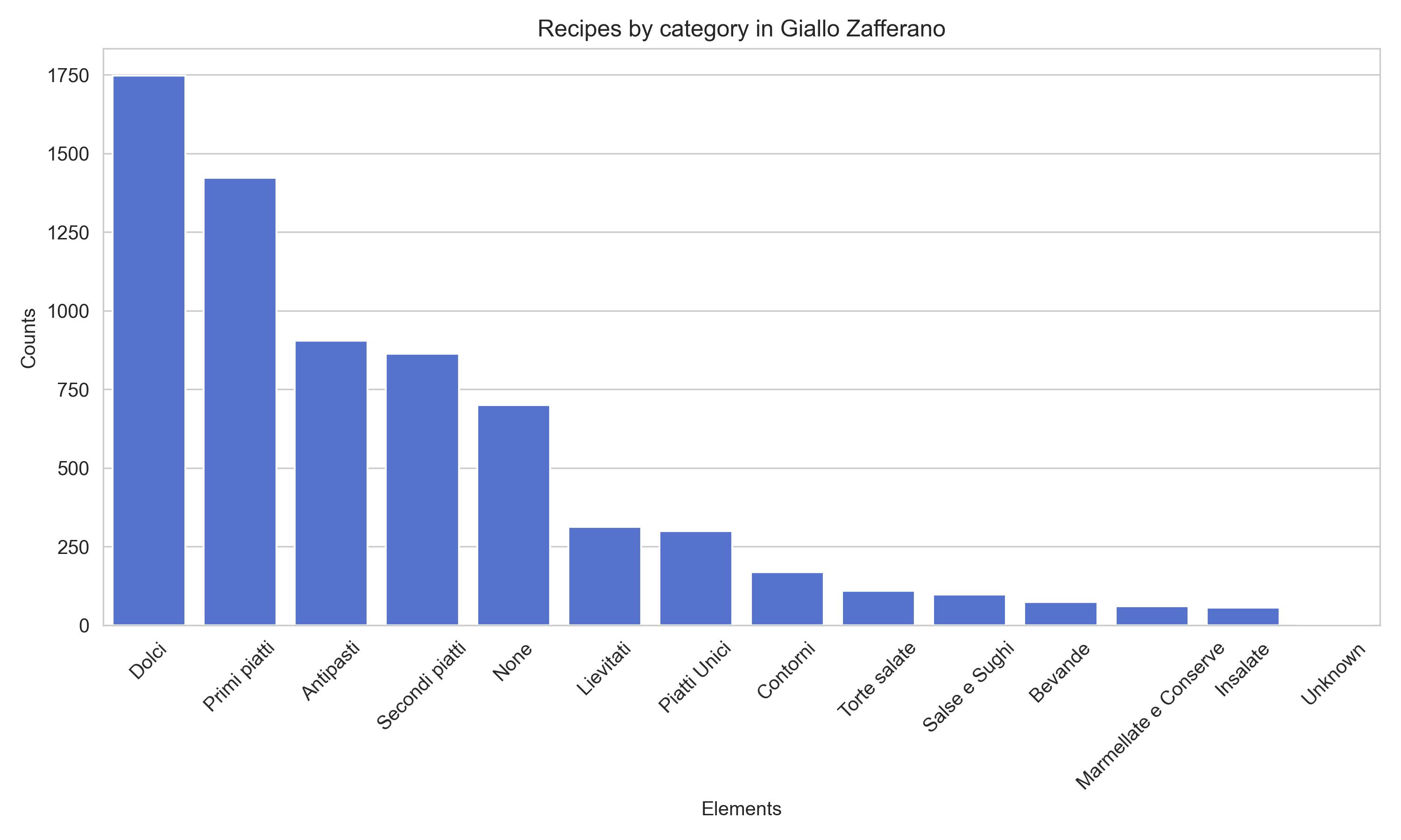
At the time of running the scraping (29th March 2024) I ended up with 6819 recipes; each recipe comes with ingredients (what I care about), a category and of course the procedure. The total of ingredients overall is 1763 - counted as unique strings, so different spellings or writings of the same thing (possible!) will contribute to this count.
Categories
So, a typical (?) Italian meal is made of a:
Primo - carbs with sauce, veggies or meat/fish: this is your pasta dish, but to smaller extents there’s dishes with rice or other grains. Soups and similia fall in this category too;
Secondo - meat or fish;
Contorno (side dish) - goes with the secondo: think veggies;
Fruit/Dolce - either or both, dolce is the dessert. Usually people have fruit at home and a dessert only when eating out or on Sundays and special occasions, but of course, it depends.
Now, what is “typical” is up for discussion of course. I follow a bunch of great creators on Instagram and what they cook, reinterpret and create is far from this “typical” (for instance, I think it’s become way more popular to create bowls or otherwise “complete meal” dishes), but let’s stick to this for the sake of argument, and also because that’s how GF is organised.
Categories of recipes in the Giallo Zafferano site. Italian labels - it surprisingly turns out that "dolci" (desserts, cakes, sweet stuff) are the most popular.
Desserts trump primi in GF, this was to me a bit of a surprise.
Primi piatti, with ChatGPT
I’ve decided to focus on primi piatti (first courses), mostly for the sake of reducing the scope of work but also because I feel that they’re really the core of where you find genuinely Italian stuff.
This is where the fun began - I started looking at the ingredients for “Primi Piatti”, expecting naturally that pasta would take the lion’s share. Of course, pasta, like us humans, appears in many formats and shapes, so I knew I had to do some words-grouping.
The total of unique ingredients for first courses is 857.
My lovely aid ChatGPT (with GPT 3.5) was instrumental in achieving the grouping of this long list into subcategories: I’ve gone down an iterative process of repeatedly asking it to isolate all ingredients belonging to a group from the list, and it did pretty well. For example, one group was “pasta” and a prompt asking for all pasta types in the list produced a fairly long list of pasta shapes indeed - really helpful. The groups to ask for were decided by me; I’ve worked off of common sense and my knowledge of the food of my roots, but I’ve also iteratively looked at counts of what was popping up most frequently amongst recipes: for example, things like oil and salt are at the top of the frequency list for obvious reasons and I’ve decide to establish a group for “condiments”.
The whole process still took some human refinement, the aforementioned decisions on what groups to ask for in the first place and of course lots of checks: GPT was very helpful but it did sometimes hallucinate either spitting out ingredients not present in my list (this seemed to happen a lot for groups that are scarcely populated, it struggled to find items for them and made many up) or missing ingredients altogether. Note that the ingredients it invented were all very plausible, sometimes plurals of existing ingredients (e.g. “cipolle” for “cipolla”), so the only way was really to check that for every list it gave me back all elements did exist in the original. Another thing ChatGPT did, but this was occasional, was misplacing items in a group.
Working in tandem by checking frequencies dynamically (while I was grouping), doing the checks and iterating made it so that at the end I ended up with 16 groups: pasta, rice, flour/other grains/bread (it can be part of a main), gnocchi, meat, fish, cheese, veggies/fruit, herbs, spices, condiments, seeds, beverages (think dishes cooked in wine), eggs, sweet things (occasionally used for primi!), dairy/plant-based replacements.
These 16 groups cover 814 ingredients - from the original 857 I’ve excluded some (about 30) clearly out of the realm of Italian food (many Asian like “Miso” and “Pak Choi”) which are used to present recipes from other places, and yeasts, plus a handful of things I wouldn’t have known how to group and that weren’t important anyway. I have also removed some frankly weird stuff like “panettone” which was used in a “risotto al panettone” recipe.
I should also note that for the items ChatGPT missed in a group, that I could see in my frequency counts, VSCode was very helpful as its automatic (?) parsing of a repo made it super easy to add them in a list (typing two chars gave the whole string quickly).
This dataset of 16 groups and 814 ingredients I’ve obtained this way also had the additional feature that the most complex groups had been separated into subgroups, for instance the meat group has subgrouping by type of animal - this was all courtesy of ChatGPT as I didn’t ask for it specifically.
A few notes about these ingredients:
There’s a plethora of recipes for things like lasagne or cannelloni, which are technically pasta, but the recipe makes you do the pasta from scratch so the base ingredient is flour - this contributes to the flour/grains/bread group. Similar reasoning applies to gnocchi recipes, most recipes make you do them from scratch.
the cheese group is all genuinely Italian cheese apart from a handful French ones - I left them in as they’re popular and much used in Italy too.
“peperoncino”, the vulgar name for what is - I think - Cayenne, has been placed with all its appearing varieties within the “spices” category even though there are dishes with the whole vegetable, but in order to know whether it’s used as a spice only or a base thing you’d have to manually check the recipes, so I’ve taken a call.
In the pasta category I’ve left those instances of pasta made without wheat (gluten-free versions) or with more than just wheat, like the types added with legumes.
The data card
I’ve decided to use a treemap for this, which is a type of graphic showing the proportion each item occupies in a dataset as part of a big rectangle: each item is itself a rectangle and the fun thing is you can nest treemaps, so you can easily create the sub-treemap for each item - which is exactly what I’ve done here with the subgroups of ingredients. This has been the primary reason why I chose this type of representation, but I also just really like it, I think it conveys information very quickly. I could have hardly used anything else for this two-layer data.
Ingredients from Italian mains divided into groups and sub-groups. Each group has a colour, indicated at the bottom, and groups have nested subgroups identified in writing.
Each rectangle is a group of ingredients and is coloured accordingly - I have tried to use “representative” colours, that is, colours that would easily give you a mental map of each group: for instance, I’ve used green for veggies/fruit, pink for meat and light blue for fish. Some colour choices are admittedly more dubious (like a light brown for cheese), but it was those things that didn’t immediately call for a hue in my mind (and also, I needed to generate enough diversity in colours for you to be able to distinguish things). Every group shows the number of ingredients that belong to it (bottom-right of each rectangle).
The treemap-nesting is evident: those groups of ingredients with subgroups (thanks again to ChatGPT who did the heavy-lifting here!) share the colour but are identified by sub-rectangles.
So what do we learn? Of course, the obvious stuff like Italian food is rich in pasta dishes or that there’s a fair use of meat and fish. But also, that vegetables are really common, varied and (my addition) exploited for maximal flavour: you can easily be a vegetarian in Italy (vegan is a bit more difficult due to the love for cheese, but this is all another story).
Notes for improvement
It has escaped me that “yoghurt” is not listed in the “dairy/plant-based replacements” as it should but is instead part of the “condiments” group. This was ChatGPT’s choice and I’ve apparently not noticed/thought about it, either when checking things or when drawing. The other thing about yoghurt as an ingredient for a main course is that it feels weird for Italian food, so I went to check (after everything was done) which recipes it belonged to and it is a combination of sauces and dressings. It should have been in dairy anyway.
Sweet things are also dubious: there’s things like chocolate and honey. They are used for genuine main recipes but arguably it’s very niche things.
Anything else that looks weird to you? Let me know!
Liked this? I have a newsletter if you want to get things like this and more in your inbox. It’s free.
I had to apply a fix because the code breaks for a recipe (just one!) which defied the common HTML scheme - I’ve PR’ed it here. ↩
]]>Martina PuglieseArtificial neurons and logical tables2024-03-09T00:00:00+00:002024-03-09T00:00:00+00:00https://martinapugliese.github.io/excursus/neurons-logic-tablesA post on artificial neurons, which are somewhat the basis of neural networks, themselves the basis of artificial intelligence! The topic is of course long, rich and multi-faceted, but let’s dig into some of the foundational ideas.
The human brain has 100 billion neurons, each neuron connected to 10 thousand other neurons. Sitting on your shoulders is the most complicated object in the known universe. Michio Kaku, in an interview (2014)
Neurons
Neuron theory
For a long time, scientists believed the human brain was a single, continuous chunk of matter organised in a reticulate with floating small organs that behave in an undifferentiated way.
It was Santiago Ramón y Cajal (1852-1934), a Spanish medical researcher, to illustrate, literally, that it is instead composed of individual unit cells connected in such a way to form a hierarchical system capable of performing highly specialised tasks.
Ramón y Cajal wasn’t born in a privileged or well-known family and he came from a small village, but his father - a doctor - initiated him to the science and practice of medicine, although this was still the time when surgeons and barbers where one and the same: you went for a haircut to the same place where you went for a wound suture or a tooth removal - indeed the “barber pole” with its white and red colours has its meaning in this.
Santiago Ramón y Cajal moved to Zaragoza to study medicine as a young man and then spent his career in several notable cities in Spain, most importantly Madrid and Barcelona. He was also called to serve in the the Ten Years’ War (1868-1878) against Cuban rebels, performing medical duties for the army.
From an early age he displayed an amazing talent for drawing and throughout the years he produced many very-detailed and beautiful illustrations of brain matter which became pivotal to the emergence of what became known as the “neuron theory”. His illustrations are used to this day, and indeed they are beautiful.
One of Ramón y Cajal's drawings (CC) from Wikimedia. You can appreciate way more in the online exhibitions in the references.
Ramón y Cajal perfected Camillo Golgi’s staining method, which allowed for the clear visual isolation of just a subset of the cells in neural matter by virtue of a process known at the time as the “black reaction”, which made just a few cells appear as coloured in black. This way, he could then put what he saw on paper, which allowed him to understand how neural matter really is structured.
His work wasn’t really appreciated from the start, quite the opposite indeed. On top of the fact that it proved to be really hard to dislodge the common conviction within the scientific community that the brain wasn’t made of individual cells, he also suffered from outright discrimination within scientists’ circles (which were very elitist) due to his modest upbringing. It took a while for the neuron theory to be accepted: Golgi himself, in his Nobel lecture (text available here) states “I shall therefore confine myself to saying that, while I admire the brilliancy of the doctrine which is a worthy product of the high intellect of my illustrious Spanish colleague, I cannot agree with him on some points of an anatomical nature …” and delivered a whole speech critical of the idea.
In any case, his is a story of resilience, talent and rigour. In 1893 he published a book called “Nuevo concepto de la histología de los centros nerviosos” which was immediately translated in several languages and became the basis for a new way to look at the study of the nervous system.
The word “neuron” was coined around the same time by Wilhelm Walyeger after studying these new developments. In 1906 Ramón y Cajal shared the Nobel prize for Physiology & Medicine with Golgi himself (who, as we saw, still wasn’t convinced by his work …). After that, he became a national legend, but with his humble and servant-oriented personality he always kept a low profile, devoting his time to teaching and research and setting up organisations to help young Spanish researchers advance in their work and get international recognition. He really believed in science, he looks to me like a genuine passionate scientist who didn’t care for politics and fame.
I don’t think he is very well known to the general public, and that’s a shame given the importance of his discoveries, so I thought I’d write a few lines.
The artificial neuron
The neurobiology of the brain has inspired the idea to create “artificial” networks of “artificial” neurons that could function as mechanisms to learn patterns.
Neurons transmit information by virtue of electrical and chemical signals that propagate through the cell and act at the interfaces, the synapses. In an artificial paradigm aimed at creating a modelled representation of a neuron, we can envisage units that emit an impulse (“fire”), hence passing information to neighbours, or stay quiet.
🚨 It is super important to stress though that artificial neurons and networks have never been designed to “imitate” the brain. As F Chollet writes in his book “Deep Learning with Python”,
“The term neural network is a reference to neurobiology, but although some of the central concepts in deep learning were developed in part by drawing inspiration from our understanding of the brain, deep-learning models are not models of the brain. There’s no evidence that the brain implements anything like the learning mechanisms used in modern deep-learning models. You may come across pop-science articles proclaiming that deep learning works like the brain or was modeled after the brain, but that isn’t the case.”
Biology worked as an inspiration, not as something to resemble.
You know I like to doodle to show concepts. In the following, rather than doodling on paper I’ve used a brilliant tool called Excalidraw, which allows you to create quick illustrations with a handmade feel.
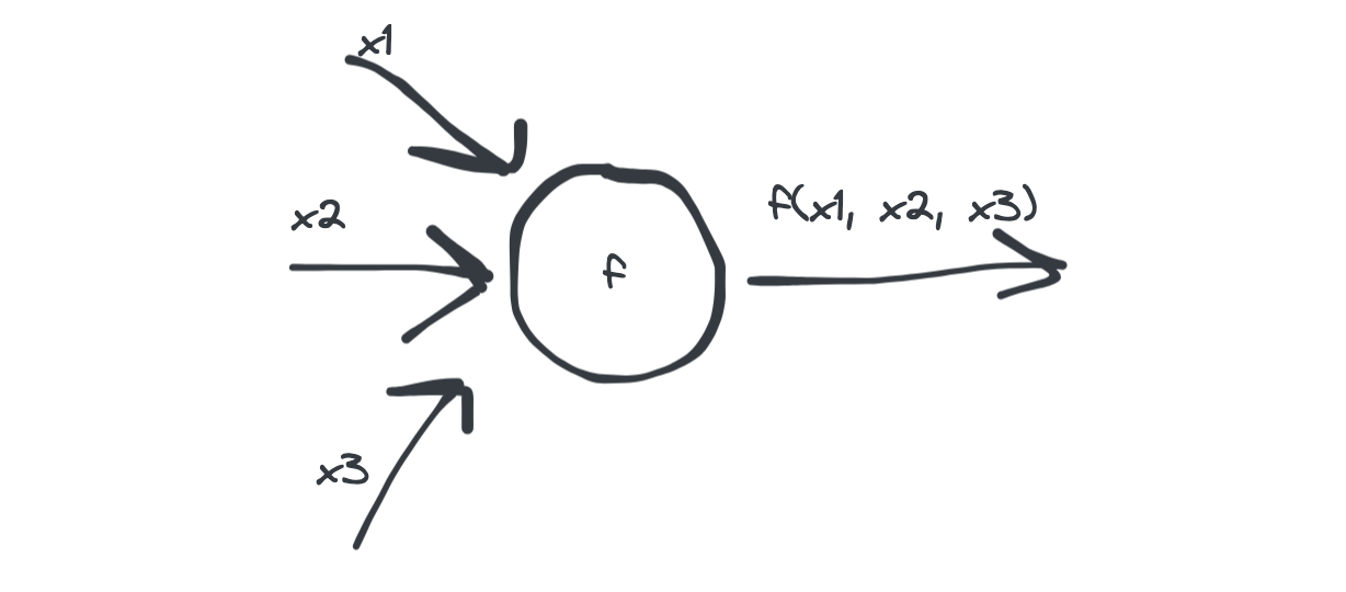
A basic unit
An artificial neuron can be thought of, in its bare bones, as a entity that takes several inputs, say \(n\) and call them \((x_1, x_2, \ldots, x_n)\), and generates one output by applying a function \(f\) on them:
A bare bones representation of an artificial neuron with just 3 inputs.
\(f\) is known as the activation function and it can vary depending on the type of neuron one is building - we will see a very simple version in the following section.
Before getting passed to the activation function, inputs are added up, so effectively the output is given by \(f(x_1 + x_2 + \cdots + x_n)\).
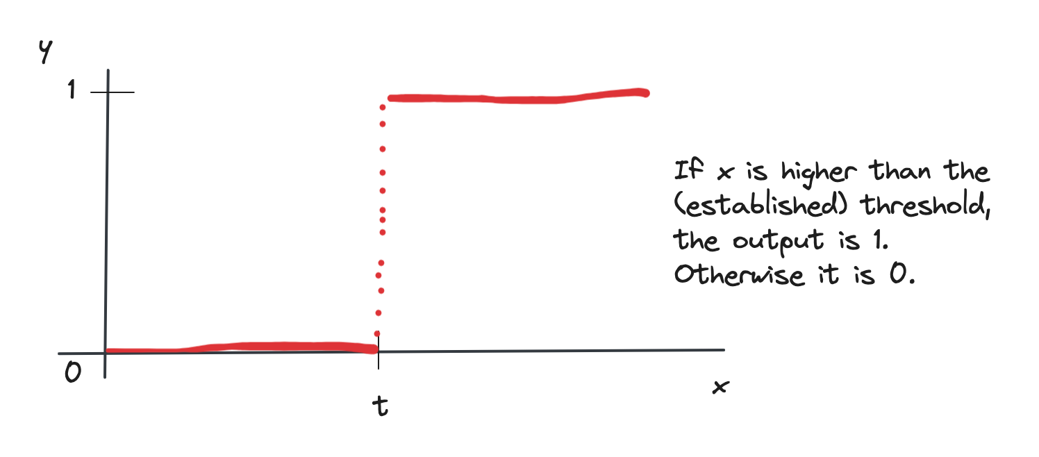
The McCulloch-Pitts unit
In 1943 W MCCulloch and W Pitts (yep, it’s the prehistory of AI) developed a simple mathematical model for an artificial computing unit which used the idea illustrated above, but assumes that
inputs are binary, meaning they can take only 1 or 0 as value
the activation is a step function, based on a threshold \(t\): the unit fires only if the sum of inputs is greater or equal than \(t\)
inputs can be excitatory (which means they pass through) or inhibitory (which means a 1 is inhibited, that is, doesn’t pass through). Inhibitory inputs are usually identified by a circle in the diagram
This is the step function:
A step function with threshold t.
which mathematically writes as
\[f(x) = \begin{cases}
1 & x \geq t \\
0 & x < t
\end{cases}\]
The McCulloch-Pitts unit was the basis of the simplest neural network built, the Perceptron.
This paradigm is really simplistic and not the one used today anymore, but it is nevertheless extremely educational to visually see how we can process simple functions, like logic ones. I have used Rojas’ book (see references) as the basis for this part.
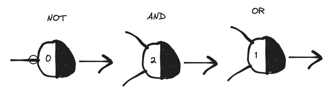
In the following, we’ll use the standard convention whereby 1 means True and 0 means False.
Let’s walk through the basic logical functions. When a function takes more than one input we will show the simplest case with just two, but the reasoning can be easily extended to a generic number of inputs. We will represent the McCulloch-Pitts computing unit/neuron as we did above, but we will split the circle into two halves where the second is black - this is to signify that the white part is the one receiving the inputs and the black part spits the output. Also, the threshold will be indicated on the white half. I’ve learned this convention from Rojas’ book which itself takes from Minsky’s work (see references).
Basic logical functions
We’ll look at the NOT, the AND and the OR.
The NOT, the AND and the OR as encoded via a McCulloch-Pitts unit, see text for details. Units (artificial neurons) are representes in the Minsky's convention with the white half of the circle receiving inputs and the black half producing the output. The activation threshold is indicated on the white half. A circle on an edge indicates inhibition.
The NOT
The NOT function works on a single input - it simply flips the value of what’s in input. In terms of a logical proposition, “I go to the gym” becomes “I don’t go to the gym” and vice versa. The truth table is:
\(x\)
NOT output
1
0
0
1
This can be easily encoded with an artificial unit by using an inhibitory input (note the circle on the edge) and a threshold of 0:
when the input is 1, the inhibition doesn’t let it pass and the unit doesn’t fire, so we have a 0
when the input is 0, the unit fires because it is greater or equal (equal in this case) than the threshold
The AND
The AND logical function (logical conjunction) with two inputs yields a True only if both are True. From the perspective of logical propositions, if I say “I go to the supermarket and I buy apples”, it means I do both things. If any of the propositions or both are false, the result is false. Truth table:
\(x_1\)
\(x_2\)
AND output
1
1
1
1
0
0
0
1
0
0
0
0
This can be encoded as a unit whose threshold is 2 and with two inputs:
when both inputs are 1, their sum is 2 which is why the step function outputs a 1
when inputs are different their sum is one, which doesn’t pass the threshold and output is 0
when both inputs are 0 their sum also doesn’t pass the threshold and output is 0
The OR
The OR (logical disjunction) with two inputs yields a True if any or both of the inputs are True, False otherwise.
\(x_1\)
\(x_2\)
OR output
1
1
1
1
0
1
0
1
1
0
0
0
The OR can be encoded by a unit with a threshold of 1:
when one of the inputs is 1, the output is 1 because the sum passes the threshold
then both inputs are 1, the sum is 2 so it also passes the threshold
when both inputs are 0 the threshold is not passed
About the XOR
Watch out: in regular language, usually, when we use an “or” to connect two propositions we actually mean the XOR operation (exclusive OR), which doesn’t yield a True if both are True (it admits only one of the two), like when in English you say “I’ll go to the gym or to the cinema”, better and more precisely phrased as “Either I’ll go to the gym or to the cinema”. I guess we’d enter a linguistic discussion here with this, which is out of scope.
But an important note about the XOR function is that it cannot be encoded with a single computing unit! This is because the boundary between output values cannot be a line and our little McCulloch-Pitts unit is only capable of separating outputs linearly by value. Let’s see what we mean. The truth table of the XOR reads like this:
\(x_1\)
\(x_2\)
XOR output
1
1
0
1
0
1
0
1
1
0
0
0
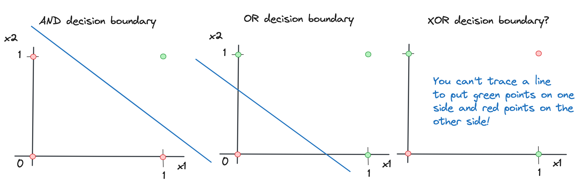
If we look at the decision boundaries of the previous logic functions and this one, which are the divides between output values, we have this situation:
Decision boundaries for the AND and the OR, as well as an illustration as to why with the XOR it is not possible to have a line. A decision boundary is the divide between different values in output as given by the inputs: in the case of AND and OR you can trace a line to separate the True outputs (in green) and the False outputs (in red); in the case of XOR, you cannot do that.
For the XOR to be encoded, a more complex structure is needed that adds non-linearity. I’ll probably expand on this point in another post at some point, but for now, I hope you enjoyed this and as always any feedback is appreciated! Read more on all this in the great references I refer to below.
]]>Martina PuglieseA journey through Caravaggio’s colours, in data2024-01-27T00:00:00+00:002024-01-27T00:00:00+00:00https://martinapugliese.github.io/data/caravaggio-coloursMichelangelo Merisi, known universally as Caravaggio, is undeniably one of the most accomplished artists ever existed. Born in Milan in the second half of the sixteenth century, he operated in several Italian cities and his work and peculiar style left a profound mark in the history of Western art, even generating a movement that took name from him.
His subjects are mostly religious/biblical (well, he worked primarily under commission) and are defined by the masterful use of light contrast (a technique known as chiaroscuro) that generate powerful visual effects.
A while ago, I did a data card on Renoir’s colours, so I thought I would replicate the work for another artist very distant in time and style from the Impressionists. I have used the exact same approach: downloading images of paintings from Wikipedia (this page) and analysing their colour segmentation with a chosen palette - more details below.
A painting and a place
As part of my data cards I (nearly) always try to recommend things that go along with them and help give some context.
Most of Caravaggio’s works are in Rome as he spent several years there. Naples however hosts one of my favourites, the “Sette opere di Misericordia” (“Seven works of Mercy”) in the Pio Monte della Misericordia, a palace (now museum) dating from the seventeenth century built by a group of youngsters engaged in charity endeavours aimed at helping the city’s underprivileged.
At some point in the early part of the century, these people commissioned the idea of creating a depiction of the Gospel’s charity ways to Caravaggio, who was new in town. By the way, young Caravaggio must have been quite the character, he had to fly Rome because he committed a homicide during a brawl. Really, he was a bit of a madcap and kept overall a high profile, living between painting and violent rioting. A letter published in The Lancet in 2018 shows evidence that he died of sepsis after a probable infection contracted as a result of a fight. He was 38 - imagine what he could have still produced if only he lived a little longer.
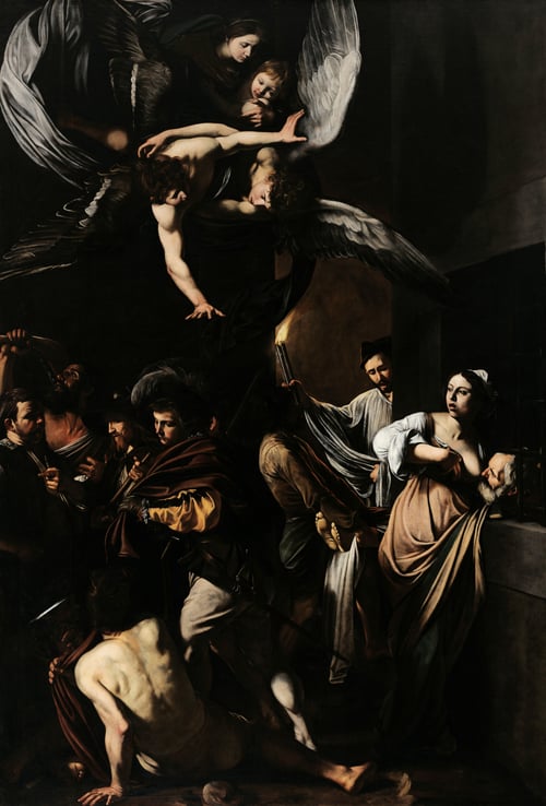
Sette opere di Misericordia, painting by Caravaggio in the Pio Monte della Misericordia in Naples, Italy. The picture shows the seven works of mercy as per the Gospel and is quite a sight. My photo (right), close-up, Wikimedia public domain (left).
The artwork is hosted in the chapel within the palace, which you can visit together with the museum, and I would highly recommend it. You can find the location by walking alongside the colourful cobblestones-paved road that is Via dei Tribunali in the very heart of the city’s historical centre, which is also home to some of the most ancient pizzerias, likely surrounded by mopeds and various people masterfully and quickly shifting pizza doughs and espressos from one side to the other. Honestly, it takes skills and practice to do that.
At the top we see the Virgin Lady with baby Christ and some angels; then the seven works of mercy are:
feed the hungry: on the right, a lady feeding a man from her breast, she also represents visit the imprisoned;
bury the dead: the main with a torch;
clothe the naked and cure the sick: on the centre-left, the gentlemen donating his coat and the figure on the floor turning his back to us;
shelter the homeless: the two men on the left, one asking for a roof and the other helping out;
refresh the thirsty: on the very left in the central part, there’s a man drinking.
Many of Caravaggio’s works contain several figures involved in complex acts so it is always worth taking the time to observe the details.
The data card
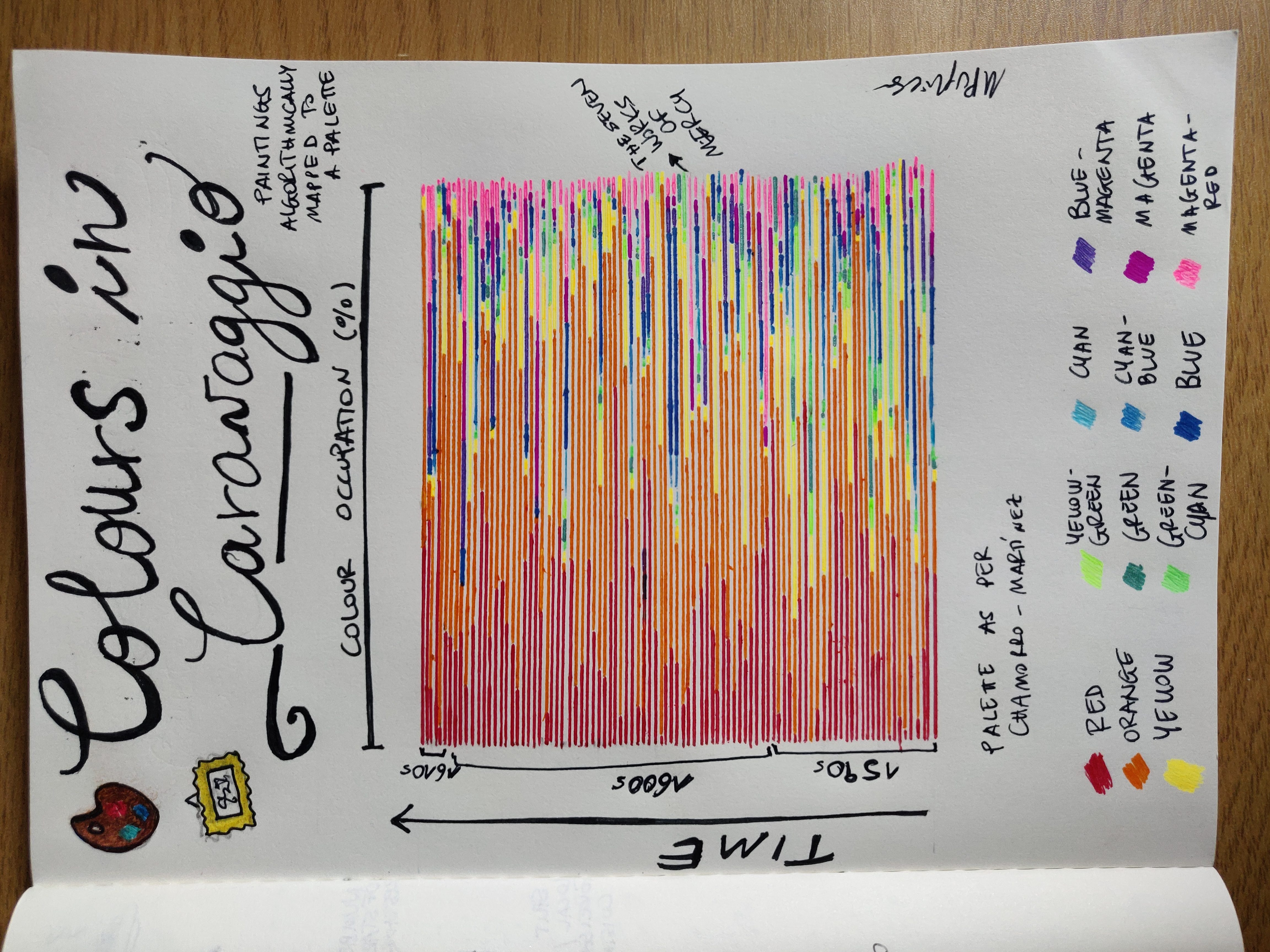
My data card on Caravaggio's art. Each bar, in chronological order bottom to top, represents a painting in its colour composition, where each colour is traced in its occupation (in percentage). Colour palette of the segmentation in the legend at the bottom.
I’ve represented all the paintings I could extract data for (from this list on Wikipedia), amounting to a total of 92; there are a few more in the list but some failed in either downloading or passing through the colour-extraction routine.
Each painting is a line and the colours represent the fraction of pixels in the image which are assigned that colour cluster (colour occupancy). The palette used, the 12 colours shown at the bottom of the card, is the one from Chamorro-Martínez et al. (like in the case of Renoir).
On the vertical axis, time as embodied by the three decades Caravaggio was active, from circa 1592 to circa 1610.
We can see that there’s a lot of warm hues, which may be slightly counterintuitive given the dark tones of many of his backgrounds, but those tones map in this palette and with this method to mostly oranges and yellows.
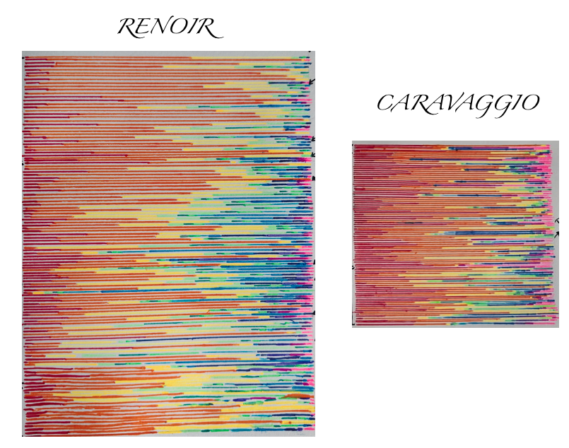
Colour parts of the Renoir and Caravaggio cards for a quick side-to-side comparison.
There are decisively less blues and greens in Caravaggio than in Renoir, given the typical impressionist flowery and light outdoors. Also, note that in the case of Renoir I had many more paintings.
All in all I would expect to retrieve similar results for any artist - the palette would have to be made more specific to actually see differentiating colour schemes.
Some details
As in the case of the Renoir card, I have been able to do this very easily thanks to the great Python library colour-segmentation - you can see all code details in this Jupyter notebook.
Caveats
The same caveats I surfaced for Renoir apply here.
Obviously, I’ve used pictures of paintings which have likely been taken with different devices and/or edited differently, which means there is no homogeneity. Also, the list of paintings is not necessarily comprehensive of Caravaggio’s work (and several of his paintings are thought to have been lost in time) and the palette used is arbitrary.
Liked this? I have a newsletter if you want to get things like this and more in your inbox. It’s free.
]]>Martina PuglieseA brief look at the interact IPython widget!2024-01-05T00:00:00+00:002024-01-05T00:00:00+00:00https://martinapugliese.github.io/tech/interact-widgetIt has been a while since I wrote a post in the tech/coding category!
These days, having some time in between jobs, I am following the excellent fast.ai course on Deep Learning, which beside its main topic is also full of small side learnings on Python, ML in general, education, ethics and more.
A few years ago I had produced some illustrative notebooks outlining the power of the Python data stack, the main one being this one, devoted to NumPy and SciPy. In there I go through some of the many features of these two libraries, mostly for the sake of giving a flavour to people who maybe haven’t used them much yet. The notebook is rendered in the nbviewer in the link but you can download it from Github here and play with it locally - just note that if you do, it will lack access to the functions I’ve placed in a common_functions module within the repo, but you can scrap that part as it’s just notebook-styling choices.
I did a talk about data science tooling to an audience of Python engineers and Scipy was were I had decided to focus - I used parts of that notebook.
SciPy is awesome. In the notebook, you can see how you can easily use it for statistical work, for solving equations, for integrating functions et cetera (big et cetera, there’s a lot you can do). I still maintain that the SciPy lecture notes are wonderful and a great way to familiarise with both Python and data science. To this day in 2024, to people asking for a list of things to study to get good in data science I feel like suggesting to give yourself the opportunity to try things with your hands and understand first principles, without going into the details all at once. The basics of stats and maths can be explored exactly with e.g. SciPy. In any case I also maintain a list of resources (many free) on this blog, which I think are fantastic.
One thing I’ve encountered in the fast.ai course is the the interact Jupyter (well, IPython) widget, which allows you to add immediate interactivity to your notebook cells, enabling some simple UI controls.
In the fast.ai course, the instructor uses it to illustrate the agreement between some points, extracted from a parabolic trend with added random noise, and the analytical form of a parametric parabola, the parameters being what you can change in the UI with interact controls. I think it’s a great way to give people a sense of how a function looks like when you change numbers.
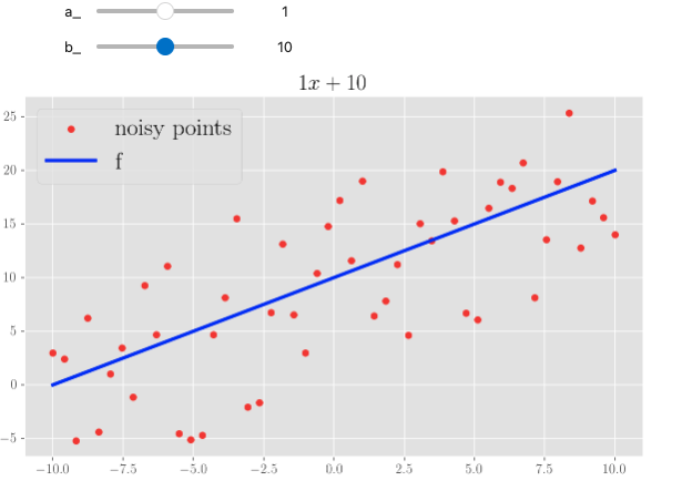
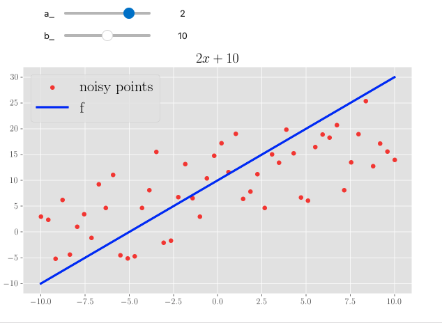
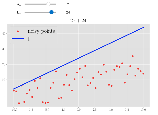
I’ve added a quick section to the NumPy/SciPy notebook (given this is still about mathematical manipulations) where I did the same, but playing around with a simple linear function - so, two parameters:
\[f(x) = ax + b\]
Note that you can also have a plot title change according to the choice.
Three screenshots from a Jupyter notebook enabled with interact. We see a changeable linear function: changing the steepness and the intercept to quickly draw different forms.
Isn’t this wonderful?
]]>Martina PuglieseThe New Year’s concert in Vienna2024-01-02T00:00:00+00:002024-01-02T00:00:00+00:00https://martinapugliese.github.io/data/vienna-ny-concertThe concert of the Vienna Philharmonic from the Musikverein in Vienna is a tradition of the first day of the year for many people, often enjoyed while cooking a big celebratory lunch to salute the new year.
This concert screams celebration, opulence, culture, history and lots of light. It has a long and prestigious pedigree, albeit not without shadows. Every year, it is led by a famous conductor and presents a series of pieces from the heyday of the Austro-Hungarian empire, most notably featuring a lot of the Strauss family.
Incidentally, if like me you forget who’s the father and who’s the son, this is the genealogy:
Johann Strauß I (1804 – 25 September) is the father;
Johann Strauß II (1825 - 1899) is his son, alongside Eduard (1835 – 1916) and Josef (1827 – 1870). He’s arguably the most beloved of the lot.
Note: Richard Strauss has nothing to do with them, he was German and one of the major representatives of Romanticism.
Music from the Strauss was overall considered “popular”: they composed a lot of polkas, quadrilles, galops, waltzes etc - folk dance tunes from Central Europe, from Poland to Bohemia and beyond. The NY concert is a big celebration of these musical forms, however we may now perceive the concert as quite “aristocratic”. The show always ends with three encores: a fast polka, the “Blue Danube” (“An der schönen blauen Donau” in the original) and the “Radetzky March”.
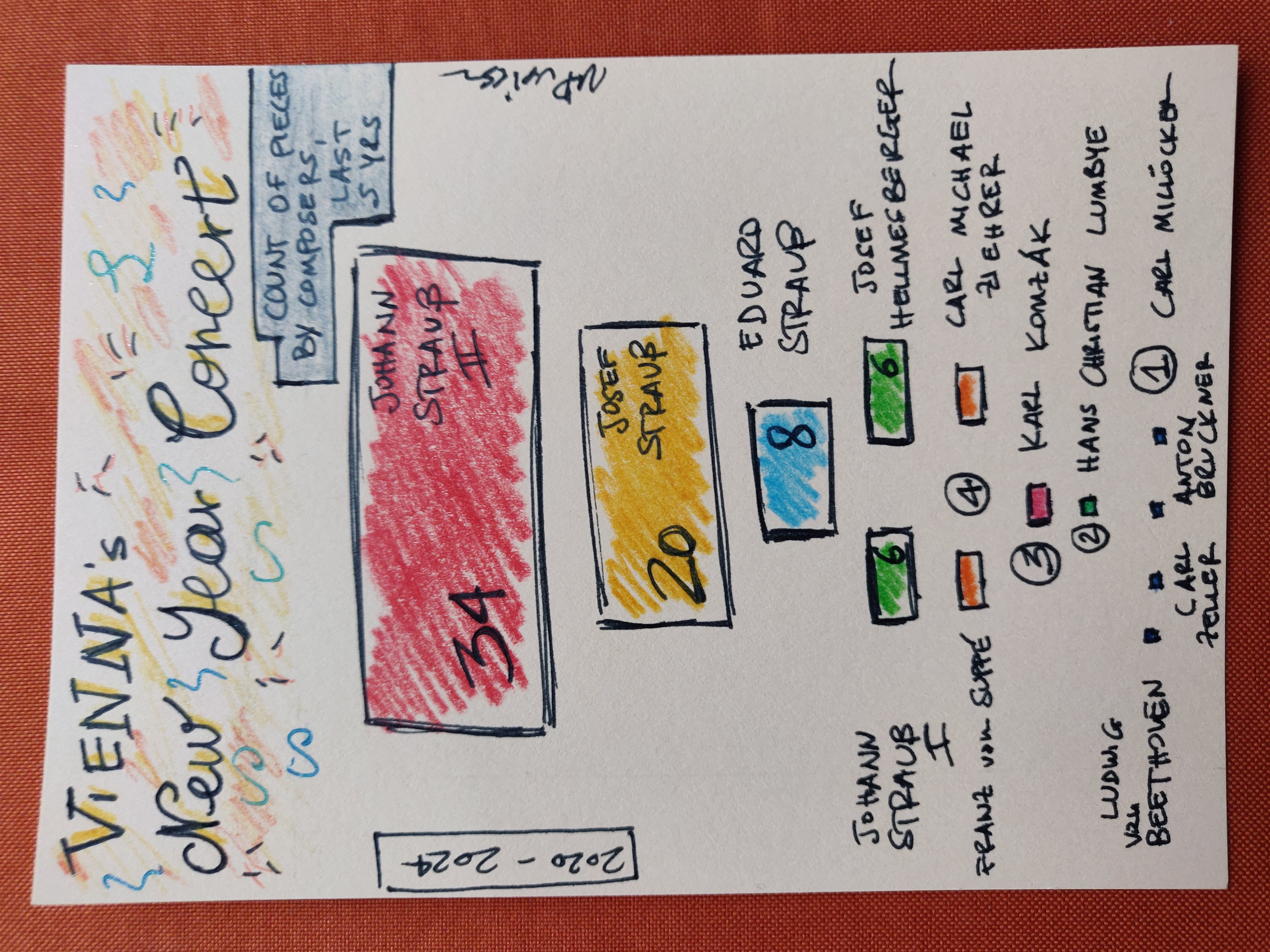
Count of pieces played per composer in the last 5 years (2020-2024) of the Vienna New Year's Concert at the Musikverein. Pieces are counted as executions, not unique ones.
I thought of many things before realising this card, but eventually resorted to drawing a quick one where I show the counts of musical pieces by composer for the last five years’ worth of concerts. By piece here I mean the occurrence, not the unique title. Programmes for past concerts are easily retrievable online.
It’s fairly simple: Johann Strauss II (the son) eclipses everyone else with 34 pieces overall - note that his is the “Blue Danube”. Following is his brother Josef with 20 pieces and the other one (Eduard) with just 8. The Vater only has 6 mentions overall and considering that 5 (one per year) are for his “Radetzky March” it’s quite a surprising low score - the sixth piece is “Venetianer-Galopp, Op. 74” played in 2021, by the way.
About some of the other ones, I personally didn’t know their names. Interestingly, Mr. Hans Christian Lumbye was a Dane, who, according to Wikipedia “In 1839, heard a Viennese orchestra play music by Johann Strauss I, after which he composed in the style of Strauss, eventually earning the nickname “The Strauss of the North””. The other big outsider is of course the magnificent Beethoven, who got a mention in 2020 with his “Twelve Contredanses, WoO 14”, also dance pieces.
Happy 2024 to all of you 🎉!
Oh, I have a newsletter (see link in navigation above), powered by Buttondown, if you want to get things like this and more in your inbox you can subscribe from here, entering your email. It’s free.
]]>Martina PuglieseDoodling Data, reloaded - moving to Buttondown2023-12-28T00:00:00+00:002023-12-28T00:00:00+00:00https://martinapugliese.github.io/doodling-data-reloadedThis is the first issue of my newsletter since I migrated it on Buttondown, where I explain the reasons. I’ve migrated all Substack posts and subscribers.
Hey there,
you're getting this because at some point you signed up to Doodling Data on its previous Substack home, which isn't active anymore. I've just migrated it here to Buttondown, so welcome again!
Reason for the move
Quite simply: Substack has openly clarified they won't censor/ban hate speech and I'm not OK with that. Some of you may not be aware of what Substack is or what happened in the recent (prior-to-Christmas) days, so here's a quick recap:
End of Nov. 2023. The Atlantic published "Substack has a Nazi problem": the author found several Substacks (at least some of which paid) spreading racist, hateful, white-suprematist-kinda-thing content. Some have clear Nazi symbols (😮). These are (mercifully) a tiny portion of the world of Substack, but they make noise (and $$, including to Substack itself). However, I bet there are more than just the ones mentioned in the article. Note: the problem isn't new.
Mid Dec 2023. Some Substack writers (including big, notable names) wrote a open letter to the company urging for an explanation.
A few days ago. The company responded, essentially saying that while they don't like Nazis either, they stand for free speech, can't be the referees of who-writes-what, and that suppressing hate speech makes the problem worse (I think that's the weakest of their arguments).
Personally, I am of the opinion that hate speech of all sorts, speech promoting the idea that some types of humans are better, speech that promulgates fake, anti-scientific and/or anti-facts stuff must be banned immediately and put in a condition not to harm society. It's the paradox of tolerance.
Heck, in places like Italy, Germany, Austria (not sure about other countries) using Nazi/Fascist symbols and paraphernalia is a criminal offence, for good reason.
Reactions to Substack's response
There's at least two schools of thought - and this is real free speech in action, a good thing:
Those who think if you tolerate in the name of free speech, you're in error - as per above, I stand with these lot. An excellent piece with a great analogy is "Leaving the Nazi bar" by Ben Werdmuller, who also moved to Buttondown. In the same crowd, I recommend this other piece (on Substack!). Note that this school of thought stresses that this isn't a zero-sum game, because given all this Substack is profiting from hate speech;
Those who think that Substack is right in not taking a stance. The argument goes that in the vast sea of publications hateful ones are just a few and you, the reader, can decide whom to follow in much the same way as for other (online and non) groups; it shouldn't be a platform's role to police content. As I said, the debate is interesting (see comments in the article) but I disagree.
What about this publication
About a year ago, I had chosen Substack because it presented itself as a refreshing place to have both a blog and a newsletter for civil conversations undisturbed by the all-present stream of ads that pollutes most other digital experiences. Naive of me maybe, but I don't regret it - I've had a great time and I've met lots of great publications I will continue to follow nevertheless. And it has allowed me to reach many people with my writing and doodling.
But, like B. Werdmuller above, I have now moved it to Buttondown, an indie newsletter platform created by Justin Duke. It has nice and friendly takes on open source and climate contributions and a minimalistic design I am really a fan of. It publishes a public roadmap (in fact, I am looking forward to some improvements) and is transparent on costs. Plus, I can attest Justin is very responsive and friendly when you have a question!
It is paid (for me, the user) because it has to cover costs of shipping emails, and that's fair. I am more than happy to pay for good software, especially if independent, and I intend to keep my newsletter free to readers, but I may open a Ko-fi page or another possibility for you to contribute to my work in the future.
I will now use this as the newsletter in tandem with my website which will host all posts (and of which you can follow the RSS feed). I still have to migrate some old Substack posts there but bear with me. You can also just follow this newsletter via RSS feed and not email. All old Substack posts are, by the way, on the migrated archive here.
I've brought all of you Substack subscribers here and I hope you stay for the ride, but if you find this annoying, if you had maybe signed up from Substack out of recommendations (a feature I never loved as it encourages "blind" subscriptions) and aren't interested, if you disagree with any of the above... please feel free to unsubscribe, no offence taken; I want this to be valuable, not a burden.