2022, annus horribilis
Friends, this one won’t be a jolly one, it’s about climate change. A couple of years ago I started producing data cards on this topic, building a small series. I will gradually port them here one by one but for now this is a new one; simple story, simple graph: the data story of global warming.
2022 has definitely been the year when climate change went mainstream. Pretty much everywhere last summer we’ve experienced prolonged heatwaves and droughts and come the wet season we’ve seen a lot of torrential rain and landslides (they still call them “extreme” and “anomalous” events in the media). If anyone was still living under the illusion that climate change was a faraway idea relegated to the realm of academia they should have changed their mind by now. Of course, it’s been at least a few years that we have climate change finally featuring prominently in public discourse, but last year was when it clearly came back at us with all its evident force. I still remember when it was just a topic for school books.
Bring-along items
A movie
In case you’ve not seen The Day after Tomorrow, I recommend it. It doesn’t have great reviews largely due to scientific inaccuracies and a vibe leaning too much on the spectacular, but I still think it’s worth a watch: we may have forgotten it now, but this movie was the first large-scale artefact about climate change aimed at a popular audience. The year was 2004.
A resource
The resource is this website devoted to climate change information created by historian of science S. Weart and part of the AIP (American Institute of Physics) suite. It is one of those beautiful old-fashioned and plain HTML websites full of good info and with an educational aim. It has many long reads and it’s really worth your time if every now and then you want to learn some more and it serves as a useful collection of links too.
A project
In 1909, for the first time in history, E. Spelterini (born E. Schweizer), a Swiss photographer and explorer, traversed the Alps from west to east in a balloon, taking pictures of the mountains and glaciers. Imagine what clunky equipment he must have been carrying.
His photographs have now provided scientists with the possibility to reconstruct them into 3D models, and also to perform comparisons with the situation of Alps glaciers as of now. Scientists from the University of Dundee (Scotland) have gone through the same trip and reproduced Spelterini’s photos with modern equipment.
The project, ClimateVis, gives us a measurable comparison of the levels of ice now and circa 100 years ago. After reproducing Spelterini’s trip, the project is now working on creating time-lapses of ice retreat in various mountainous sites.
The data card
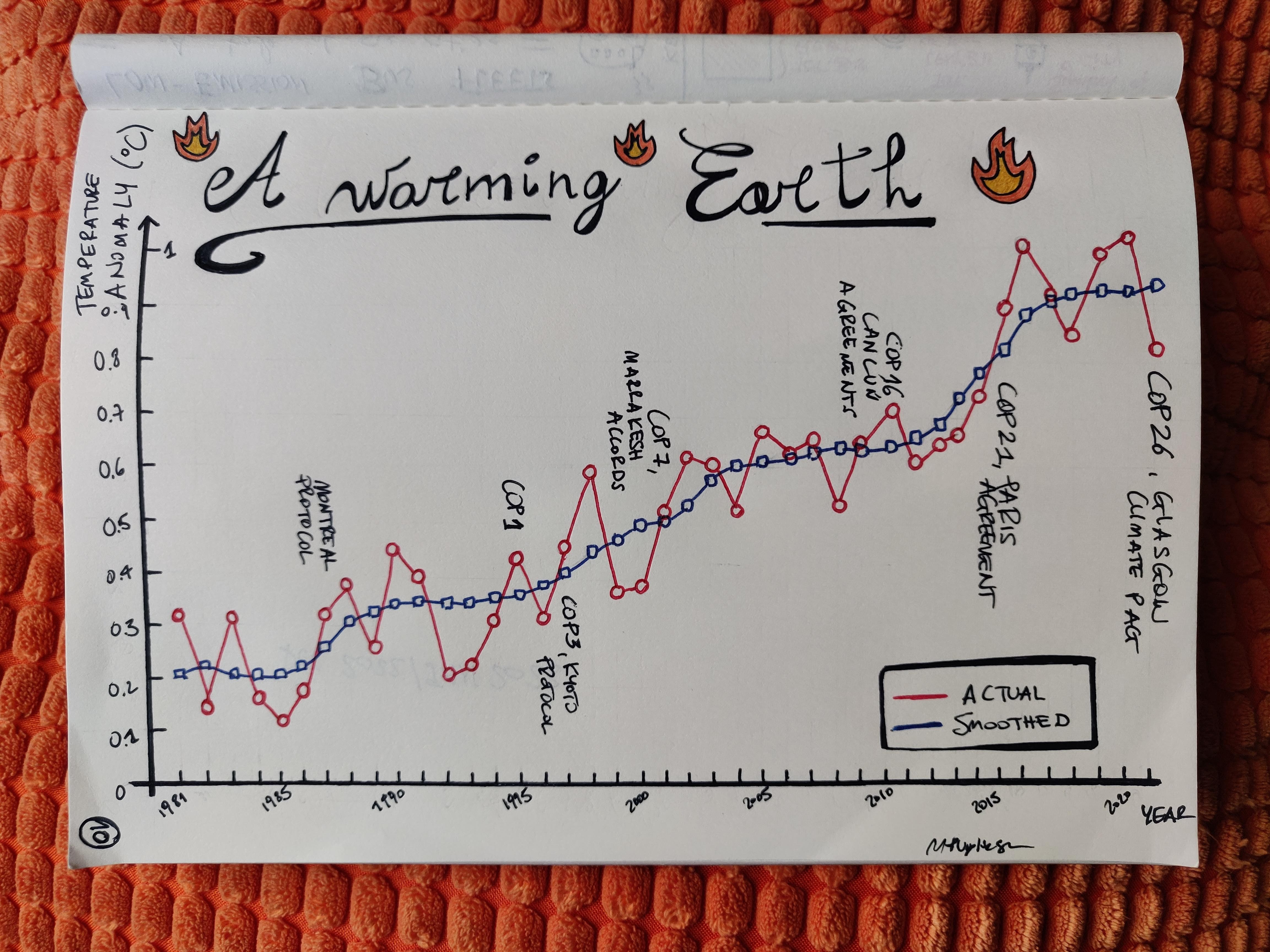
The viz shows the global temperature anomaly from 1981 onwards (last data point for 2021). The temperature anomaly is defined as the difference in surface temperature between a given year and the long-term mean of the period 1951-1980, which is why I’ve decided to report this value only from 1981 onwards. Data is from NASA, you can see the whole timeseries on their website. The “10” on the bottom-left corner refers to the fact that this is my 10th data card on climate change (I have a special notebook for them), you will see the other ones in due time.
The red line is actual points, the blue line is the smoothing (Lowess), a procedure that generates a smooth line from several points in order to see a trend.
The story is that the global temperature keeps increasing, so that the last years have been the warmest on record and we’re now 1.01 °C higher than the pre-industrial era. If you’re in Europe now you will have noticed that pretty much everywhere the past December and this January are sensibly warmer than they should. If you want to read more, “The modern temperature trend” on the AIP site recommended above is a good one.
The card also reports some of the most important treaties and agreements signed at the global scale.
And so?
It’s not all gloom and doom, folks: after doing pretty much nothing for about 40 years we have finally started moving towards change. The problem is, we’re so late now that we would need a draconian change. Anyway, 2022 was also the year when the USA passed a landmark legislation that will finally move the country towards achieving its emission commitment, and that’s a big deal. The bill is called the Inflation Reduction Act (IRA) and promises to fund the energy transition in a massive way; scientists predict that it still won’t be enough, but it’s the biggest step the US has ever taken. The EU is moving too, so we got something.
References - read more
References I’ve used for this plus some more good reads.
- The Day After tomorrow was the first popular movie on climate change, on the history of climate change website by the AIP (American Institute of Physics) *COP27: six indicateurs pour mesurer l’urgence climatique: a very lean and simple data visualisation of 6 indicators of climate change, on Le Monde, Nov. 2022
- The whole site is recommended (as per above), but “The modern temperature trend” is a good long read
- The most hopeful climate stories of the year, Distilled (by M Thomas), Dec 2022
- Science’s choice of 2022’s breakthroughs in science, which include climate news
- The NASA’s website devoted to the climate, with lots of useful info
- An interactive timeline of the main climate agreements
- Another good page about the global temperature on climate.gov, a NOAA (National Oceanic and Atmospheric Administration, a US government agency) site