
Low-emission bus fleets in cities, a data card
This post illustrates some little work I did to dig out data about the share of low-emission buses in public transport fleets in various cities in Europe. Every place is at a different stage in their transition to a more sustainable form of transportation, commitments are made and it is important to measure progress against them - this just explores the situation as of now.
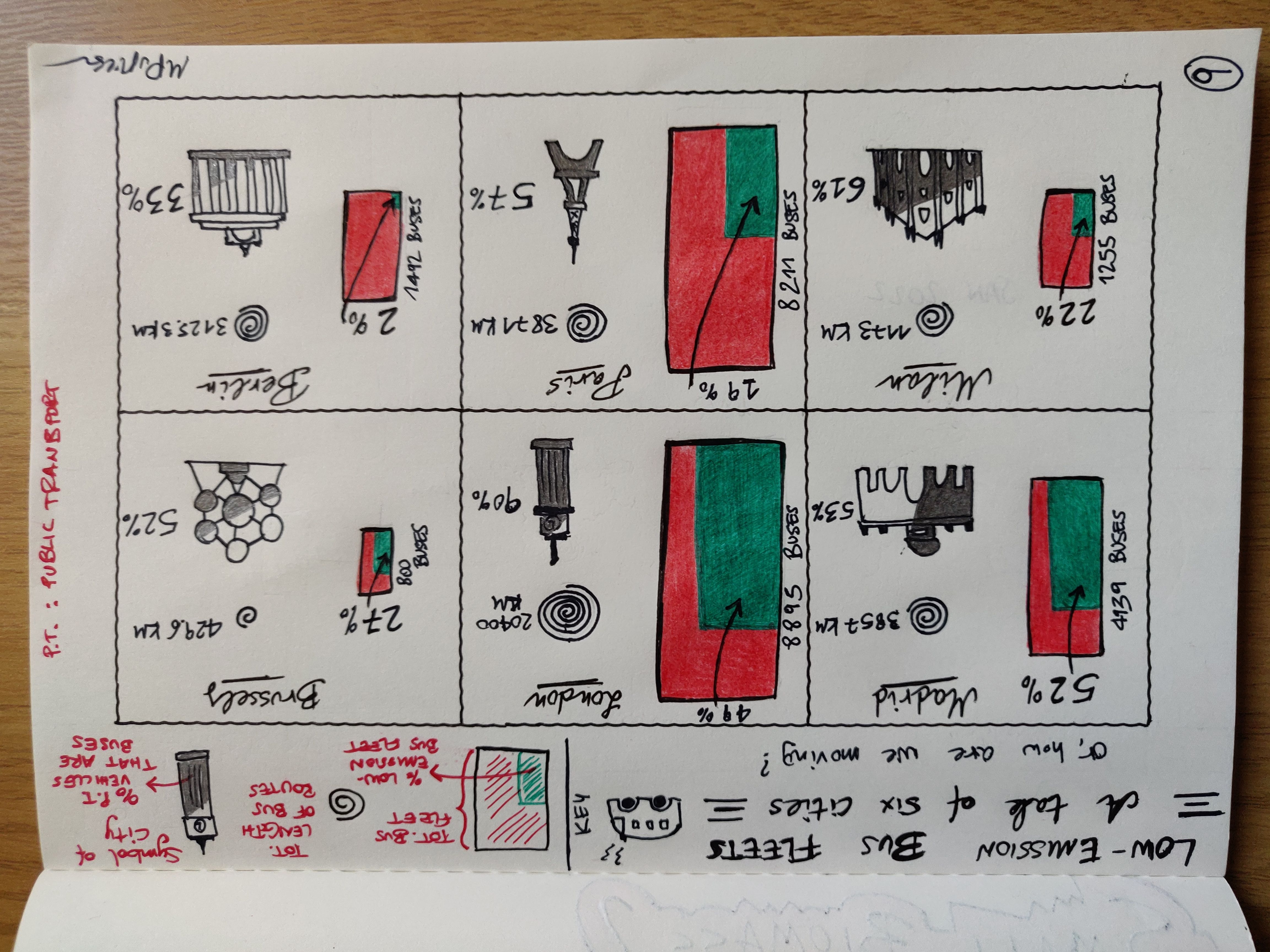
The data card is mostly aimed, as I said, at showing the percentage of the bus fleet that is low-emission in six chosen cities, ordered from highest to lowest. I wish I could have done a more comprehensive “state of the world” situation to have a reliable picture of what it happening globally, but unfortunately I didn’t find data that was comprehensive enough (see below).
The coloured rectangle for each city is proportional in size to its total bus fleet, the count being presented on the side: this is because of course bigger and more populated cities will necessarily have more busses going around. In fact, amongst the six, London is unsurprisingly the one with the largest bus fleet: a staggering near 9000 vehicles, and it is very refreshing to know that almost 50% of those are low-emission (in the form of electric and hybrid, note that London is the only city for which I could find the split). Madrid has less than half the size of London for its fleet (it is also sensibly less populated) and has a very respectable 52% of it being low-emission. Still work to do but the direction is well traced. After these two, Brussels, Milan and Paris fare very similarly; Berlin seems to be quite behind.
On the right side of this main piece of information, I have drawn a spiral representing the length of the total bus route. This drawing is done “logarithmically”, which means that an addition of a unit length corresponds (roughly, as much as I could manage manually) to a jump by an order of magnitude. This choice was driven by the fact that we are juxtaposing very different lengths, so that Brussels has a measure of 429 km (the minimum) and London 20400 km (the maximum), hence there was a need to show wildly varying numbers. Note that again, the length of the bus route is somewhat correlated to the size of a city, although there is the factor of bus coverage (how much buses cover of the city surface, with all the reasons why), which might not be uniform across cities.
Still on right, we also have the percentage of total public transport vehicles that are buses; this is drawn as the coloured part within an emblematic landmark for the city. For those, I have chosen:
- the Puerta de Alcalá for Madrid
- the Big Ben for London
- the Atomion for Brussels
- the Dome (cathedral) for Milan
- the Eiffel Tower for Paris
- the Brandenburg Gate for Berlin
This last datapoint is meant to convey an idea of how much buses are prevalent within the public transport network of the city: it may be that some cities favour other vehicles over buses, for reasons related to, e.g., the geography of the place. You can see that buses are very much prevalent in London and still quite copious everywhere else except Berlin, which has higher shares of other types of vehicles, so that it would be unfair and incorrect to claim that Berlin is not doing much towards sustainability.
The idea and the data
The idea behind this work came first by watching a short “series” by the main public transport provider in Milan, specifically this video where they talk about how they’re moving the bus fleet to be fully electric by 2030. In line with the COP26 commitments, I decided it would be interesting to explore what is happening to public transport in the world.
As always, the process to do a viz goes like: have an idea -> look for data -> validate data for quality -> reduce the scope of initial idea based on the data available. The last steps get repeated in iteration a few times until I’m satisfied that I have something decent, which doesn’t happen all the times.
So, in this case it took me a bit of digging to find valid data about public transport fleets and after researching around for a while I stumbled over the CityTransitData, a website curated by the International Association of Public Transport and Moscow Transport that report lots of useful information including the counts of sustainable and non-sustainable vehicles. It hosts (so far) data from just a few cities so I decided to use a bunch from there, focussing on European ones. Before finding this dataset, I was trying to manually collect data from city audits of public transport fleets, but because I do not know enough about those cities nor I speak all the local languages, this was tedious and not necessarily reliable. Initially I was hoping there’d be a single resource collecting all this information globally, but there doesn’t seem to be. If there had been, my viz would have likely been very different: the original idea was to show some aggregated metrics about how we are proceeding in the ecological transition of public transport networks, maybe with some notable examples. Lacking this information, I resorted to pick and choose a few cities from the data I could find and had to restrict the scope.
Now, CityTransit doesn’t have Milan, but because the idea stemmed from this city in the first place, and given I read Italian, for this city I decided to use the latest city audit of vehicles (Carta della Mobilità 2021).
Data references
- The CityTransitData website
- ATM (Azienda Trasporti Milano), most recent public transport audit, Milan