A journey through Renoir’s colours, in data
If Pierre-Auguste Renoir had Spotify, what music would he have listened to while painting in his atelier? We don’t know if he appreciated background music, but because it is fascinating to explore something with its historical context, trying to see what people saw, smell what people smelled, hear what people heard, let’s immerse ourselves in the music of his times, embracing the softness of some piano by fellow countrymen Debussy and Ravel. This video is a delightful playlist complemented by beautiful impressionist paintings, so I suggest to press play and keep reading.
We will embark on a little journey of Renoir’s colours as taken from his paintings and analysed from the quantitative perspective. The end result is a “data card”, a hand-drawn data visualisation, and I will explain the process of realising it.
This post is structured as per the TOC on the right: we will start by setting the scene with some items that help immerse us in the topic and we will then jump straight into the data card. Afterwards (but you can read this in any order), we will look at some paintings in particular and lastly we will, if you want, dig more into the technicalities of the data procedures utilised for this work: this is a section for those interested in knowing more of the data science behind this. The end section is just an orderly collection of all references used.
Bring-along items
To accompany us in this exploration, let’s choose some bring-along items: they can give us more context, make us explore deeper and bring more fun. I choose a movie, a piece of music, and a place.
A movie
The movie is “Renoir”, which has a tomatometer score of 71% on Rotten Tomatoes. It is the story of the last leg of the painter’s life, when due to health reasons he moved to Cagnes-sur-Mer on the French coast, to benefit from the wholesome seaside climate. It is a nice movie, maybe a tad slow, but worth a watch: full of bucolic scenes from the French countryside that seem to get transferred directly on canvas. Personally, not classified as something I would rewatch, but its pro is the stunning photography.
A piece of music
I would suggest Rêverie by Debussy, which is also part of the playlist linked above. It is a very mellow theme, rather introspective, that I find quite appropriate to complement Renoir’s visual atmospheres.
A place
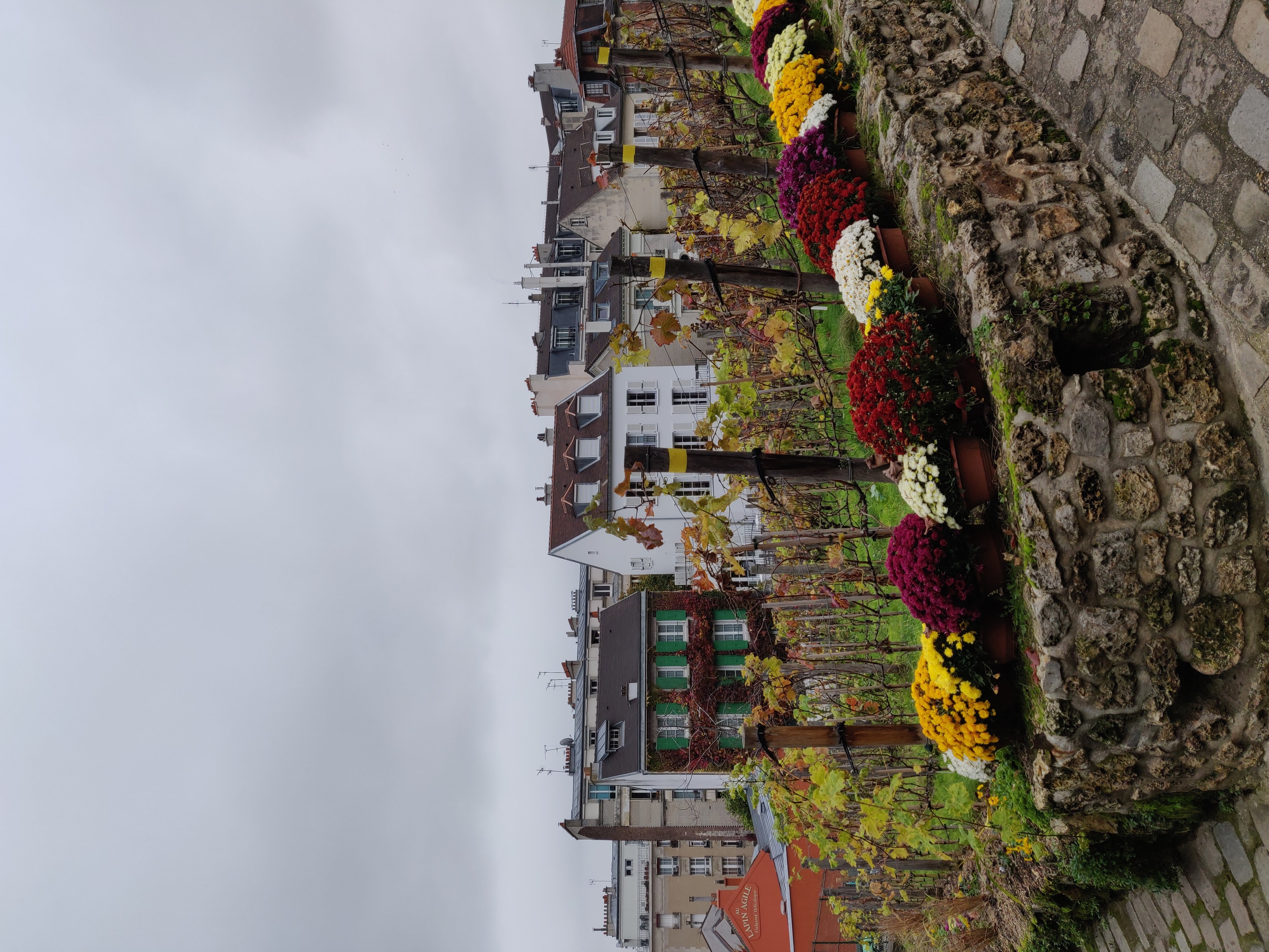
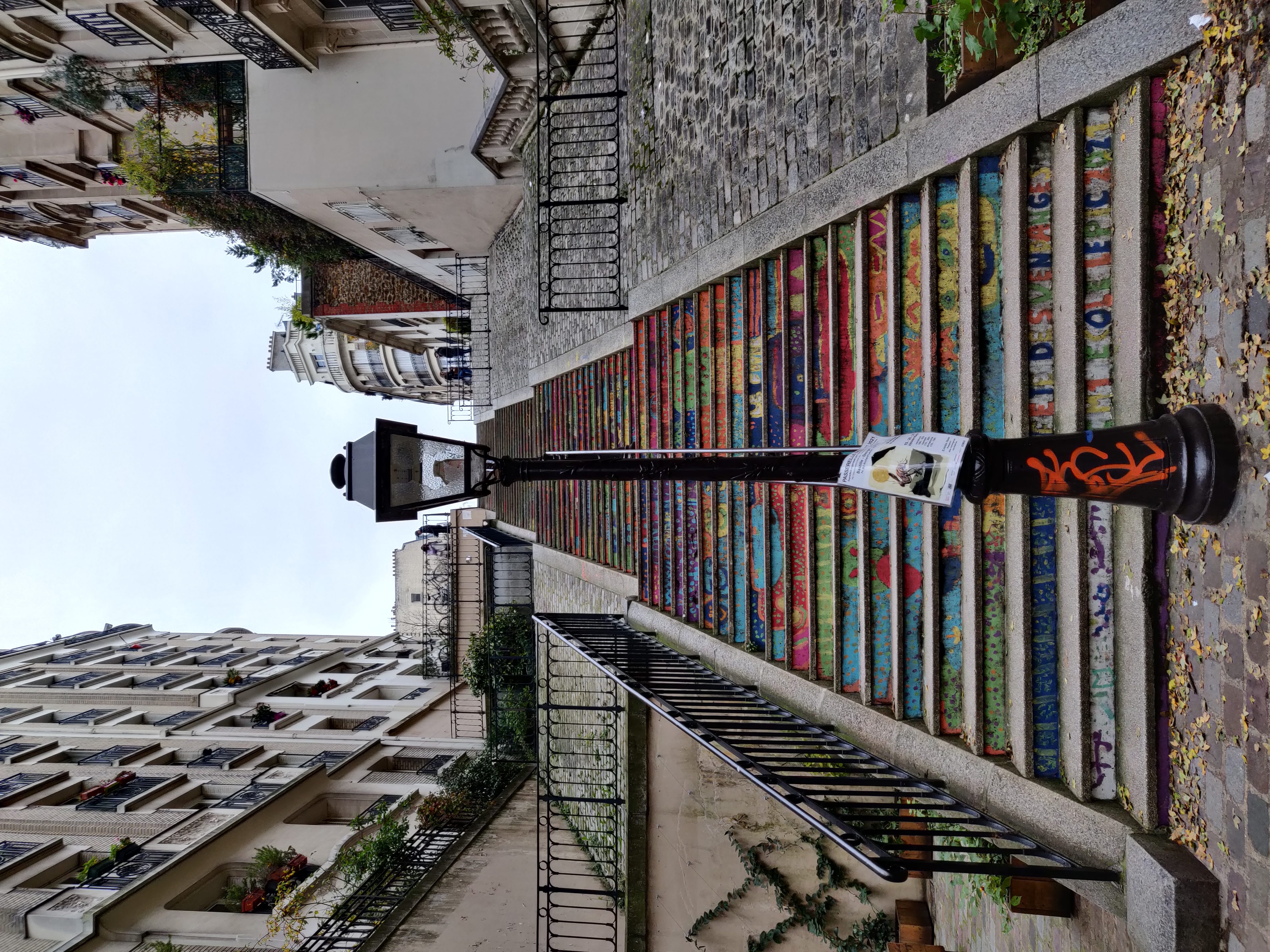
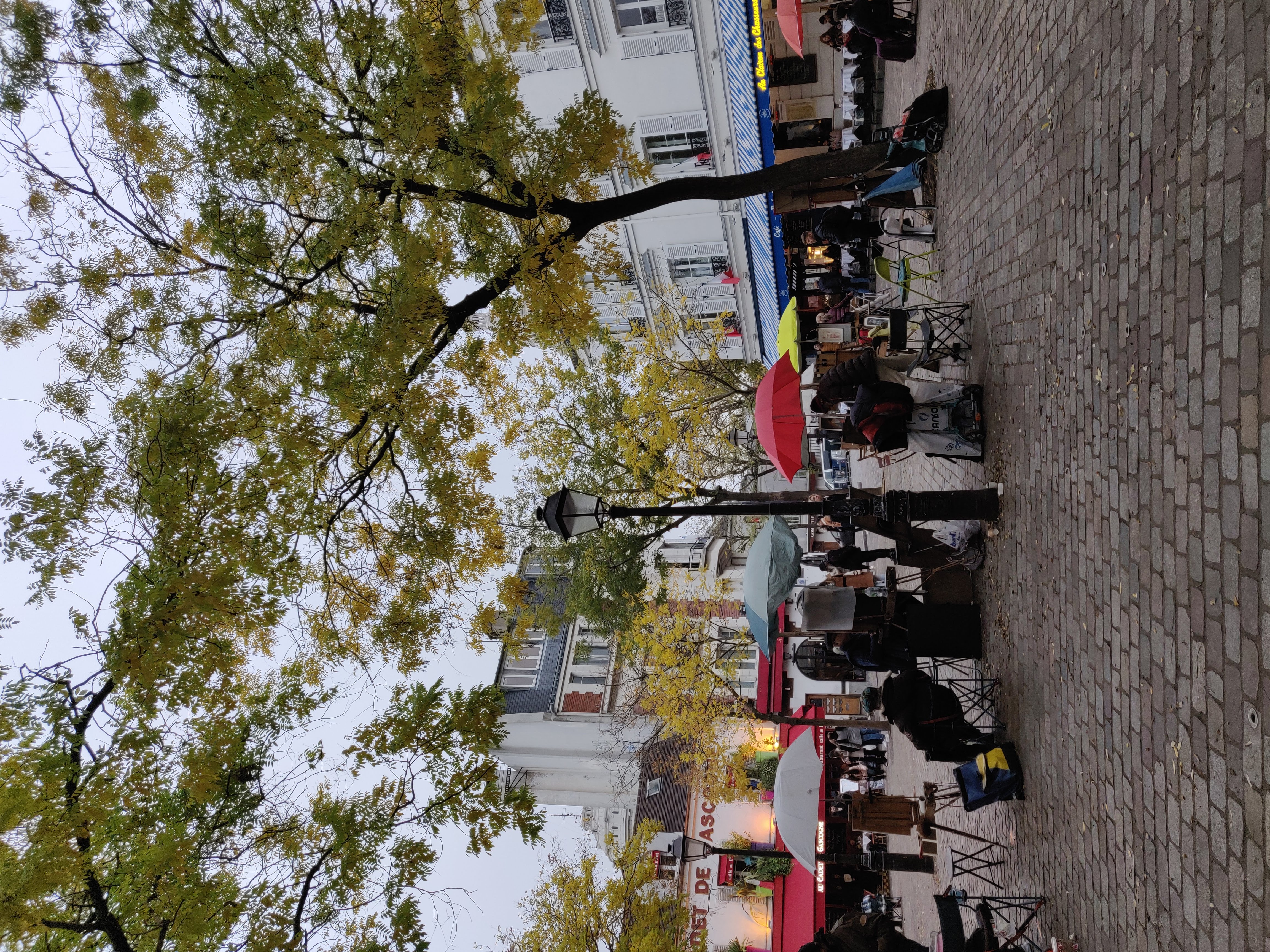
Montmartre. Renoir lived here for a while in a house that is now a small museum. This museum is nearby the Vignes du Clos, one of the historical vineyards still operating in Paris. Place du Tertre is a little square where you still find artists painting to this day. Montmartre is, as you can expect, very touristy, but very charming anyway.
The data card
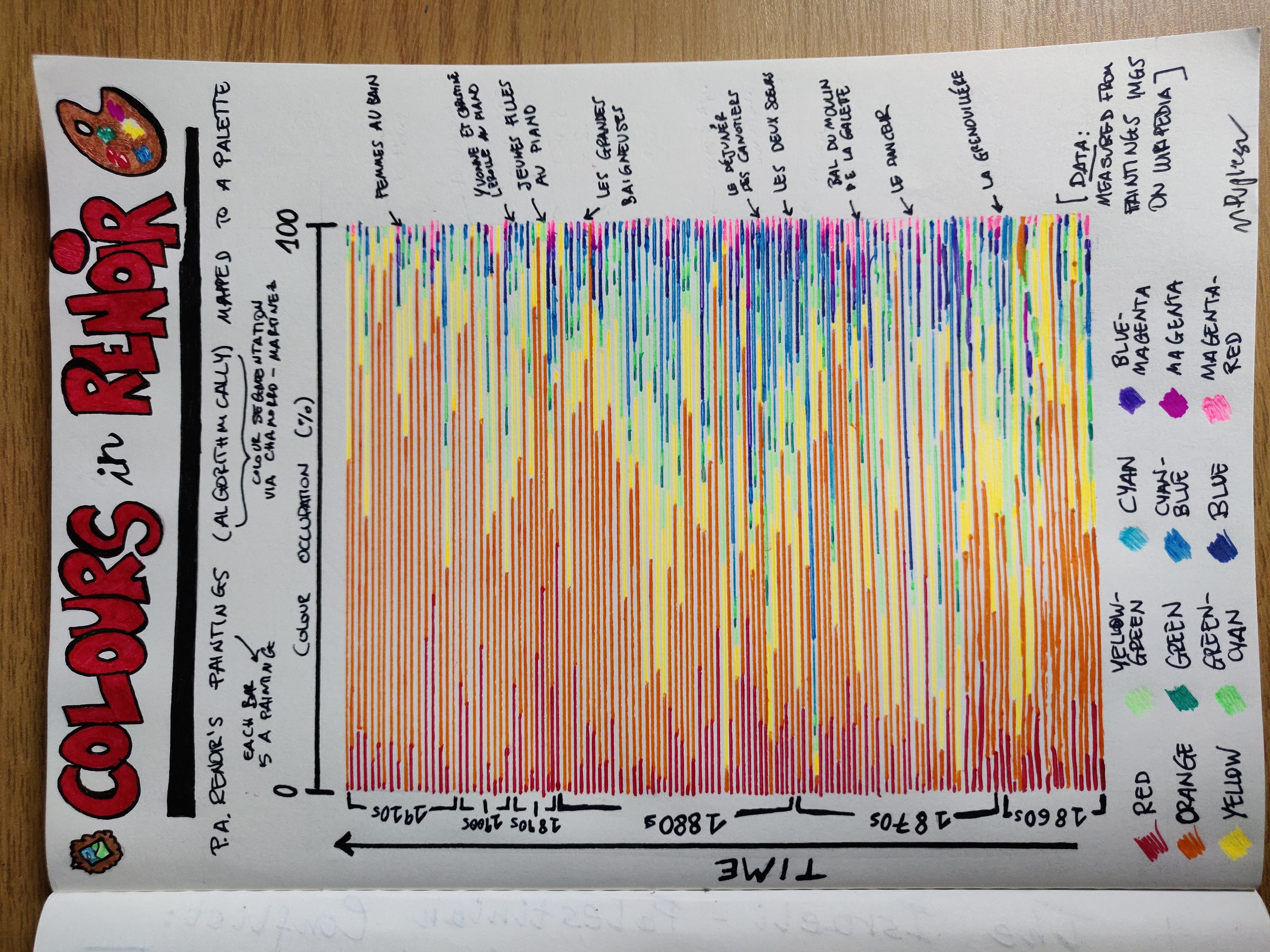
The card shows a curated selection of Renoir’s paintings, for a total of 124, in chronological order from the bottom up. Each painting is a horizontal bar and some of the most famous ones are highlighted on the right. On the left, markers indicate time and groups of paintings produced during the same decade. Each bar represents the colour composition of the painting as of the palette/legend at the bottom, so that each colour is represented with the share it takes within the painting, in percentage.
Colour segmentation has been performed algorithmically and the colour palette used is part of the algorithm itself (colour segmentation as per Chamorro-Martínez et al., see the technical section below). This palette has been considered appropriate to the task for its good balance between variety of hues and simplicity; these are its colours (order preserved in the visualisation): red, orange, yellow, yellow-green, green, green-cyan, cyan, cyan-blue, blue, blue-magenta, magenta, magenta-red. The algorithm consists of a procedure to mathematically map each pixel in an image to one of the reference colours in the palette. In the technical section below you can read some more details on this and see examples.
We notice immediately that there is a high presence of warm hues, especially orange. This is due to the background and people in the paintings: all portions with skin, brown/cream tones of the background, warm skies get mapped to those hues because they are the “closest” ones, which is not surprising and would likely be a feature of most paintings, regardless of the author.
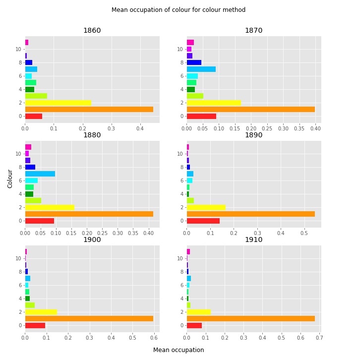
What is more interesting is that the presence of oranges and yellows seems to increase in time: the top portion in the card visibly shows a reduction in greens, blues and pinks to make room for them. All this can be easily measured from data. In the plot on the left, you can numerically see the average occupation, decade by decade, of each of the palette colours: the always dominating orange increases its grip in time.
This result corresponds to a change in style in Renoir’s art, where his last productive decades have been characterised by a preference for portraits, intimate scenes and indoor settings, branching out of impressionist precepts. In contrast, the full impressionist period, in the middle decades, is the one with the highest presence of hues relating to nature settings and clear skies.
Speedy art tour
What words come to mind when you think about this artist? For me, there are things like “pastel”, “countryside”, “nature”, “relaxing”, “sky” … so I’m clearly thinking about his depictions of people having a good and chilling time outside, in daylight and in a bucolic environment.
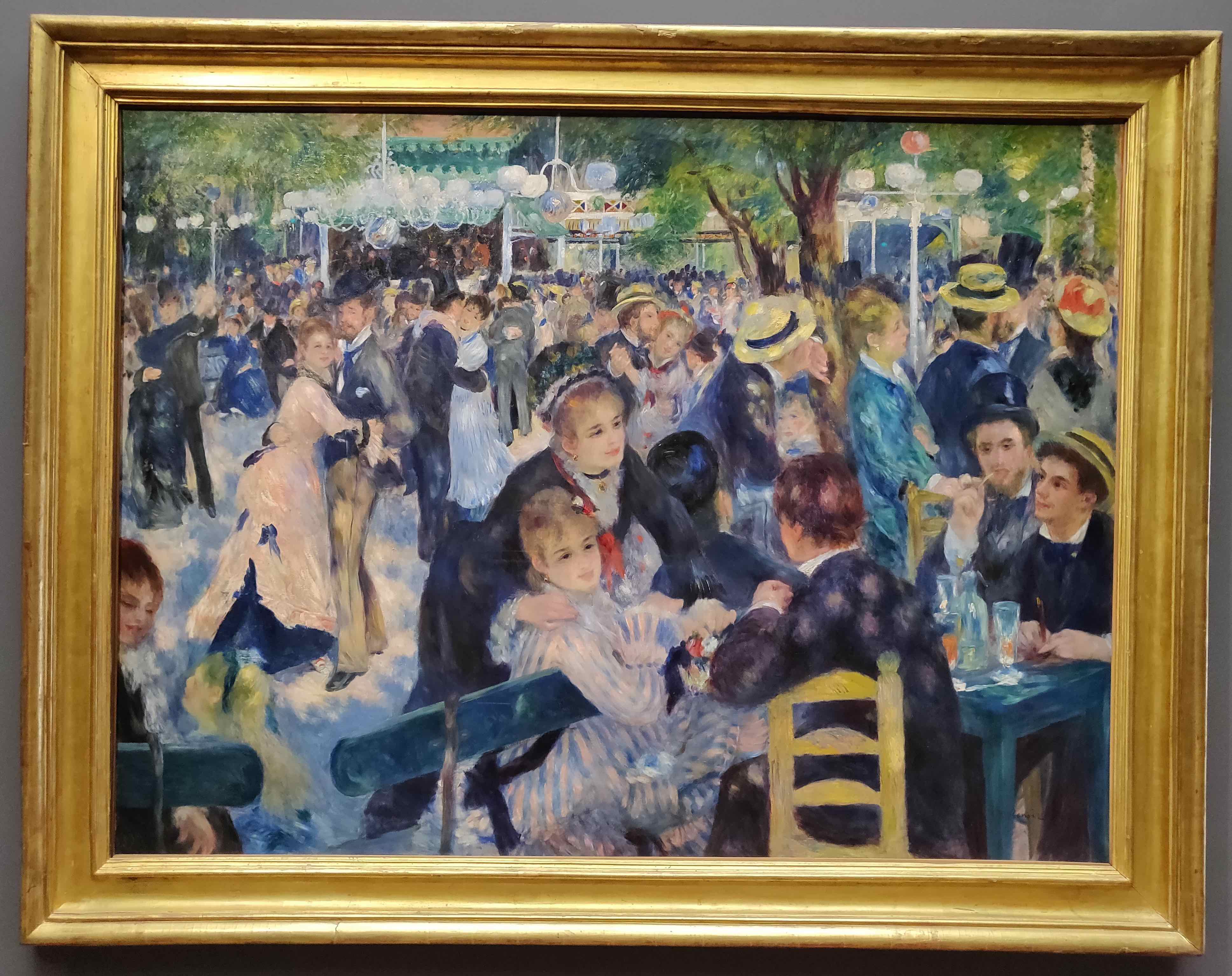
As an impressionist, his works are characterised by colourful blurbs of paint, full of glow and light, that depict figures and objects well immersed in the environment. Look at the “Bal du Moulin de la Galette”, with people merging with the surrounding yet so distinctively captured in the moment - those that dance seem to really move and those seated seem quite pensive. The “Moulin de la Galette” is a mill in Montmartre (Paris), still visible to this day, that used to be a bustling location for outdoor balls and general hanging out: the mill produced flour used for baking bread (the “galette” and cakes), eventually growing into a trendy entertainment establishment. Look at those men in the bottom-right corner, they’re enjoying a drink in a tall glass, picking teeth (?) and entertaining the ladies, one of which seems to have either just arrived at the table to catch some breath, or come to invite the others to join her on the dance floor. There is lots of joy in this painting, and look at those couples tenderly embracing. People are really having a good time. This all makes me think of the part in “Mary Poppins” where the gang jumps into a drawing and joins a countryside fair.
This painting, dated 1876, belongs to the golden era of Impressionism and in fact exhibits all of the main features of the movement.
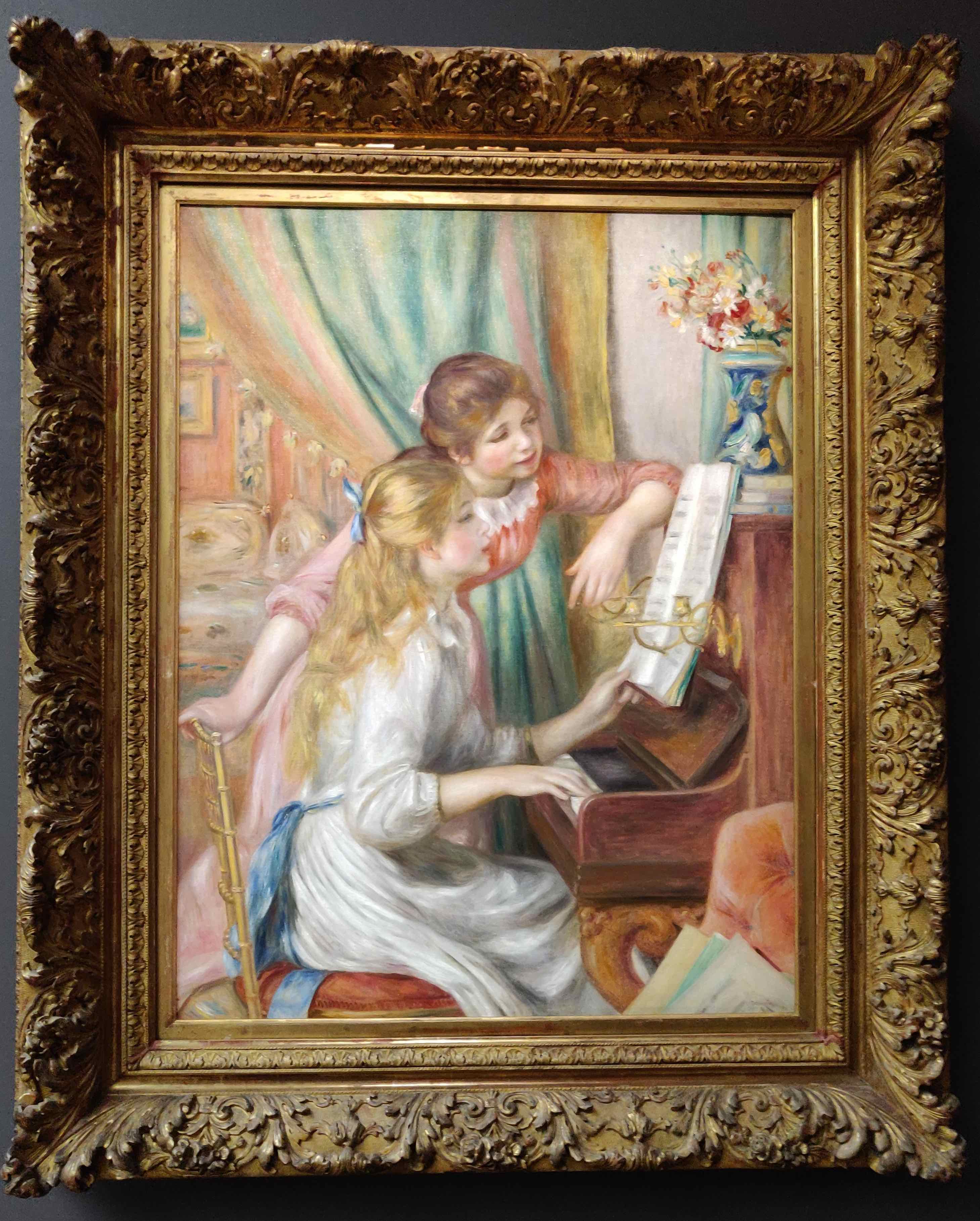
If you happen in Paris, I definitely recommend a visit to the Musée D’Orsay, it hosts an admirable gallery of impressionist works, and is an overall fantastic place to spend a full day in. Amongst the works of art hosted there there is Renoir’s “Jeunes filles ay piano”, which I find captivating with its pastel colours and the gentleness of the figures. This work, created in the 1890s, is already past the core of Impressionism by a good margin, but still preserves Renoir’s unmistakable style. It is a simple scene, but there are splendid details: look at the dresses (very 1800s!), so well rendered with easy strokes, the vase on the piano, the blurred notes on the music sheet, and then in the background, what are those light-brown patches behind the curtain, a sofa maybe?
The Musée de l’Orangerie also hosts a collection of impressionist works, and interestingly (this startled me when I first saw it) there is a preparatory study for the “Jeunes filles”, which is fascinating to compare to the end result.
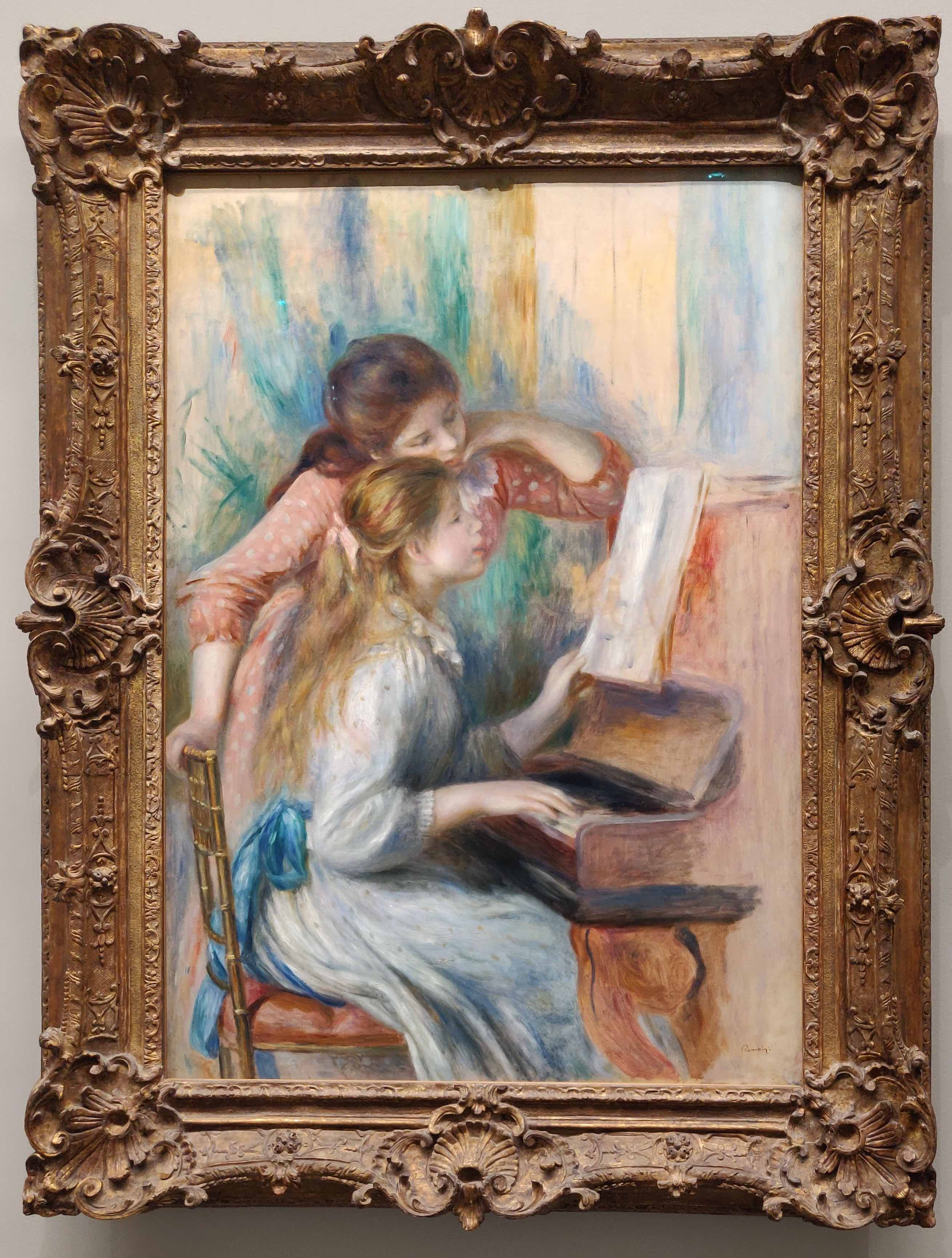
Everything from the girls to the objects appears less refined: strokes are rougher and things like the vase on the piano are missing, there is no curtain in the background and everything is less curated, which is obvious given this is a study. But the master also appears to have changed his mind in some parts going from this one to the final result: the dresses are slightly different (I have to say I quite liked the red polka dots one in this version, and note that the white one contains some dots too) and the standing girl is in a different pose, with a more contemplative feel. In fact, the standing girl in the end result seems to be there to check what the other girl does, almost in a pedagogical way, while in the study she seems to adopt more of a peer-learning attitude. Of course, the beauty of looking at paintings is that everyone can see different things in them, so this is only my reading. By the way, there are other versions of this painting, so there might be further variety.
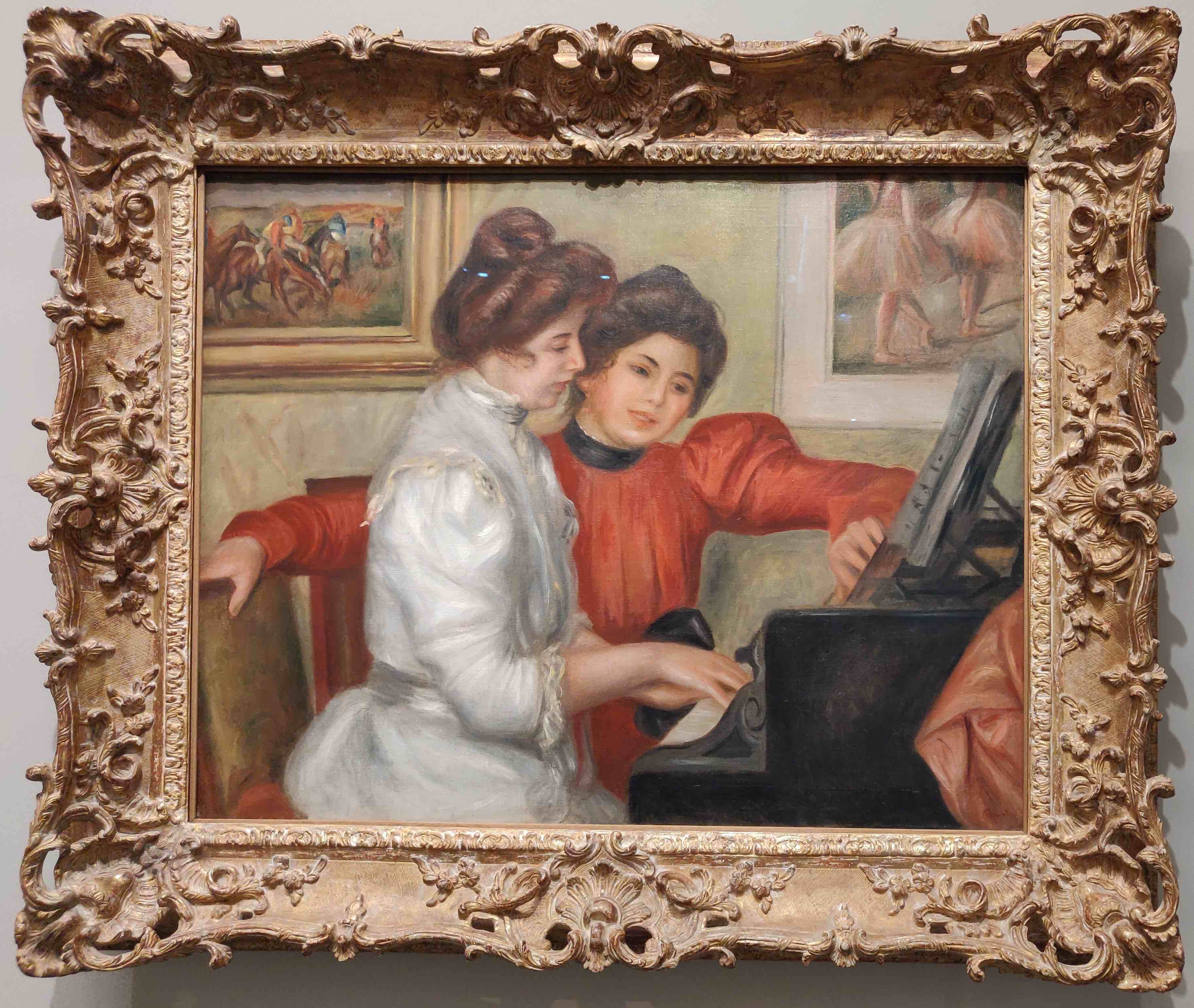
Remaining in theme of pianos, l’Orangerie also has “Yvonne et Christine Lerolle au piano”, dating from 1897 and displaying the daughters of Henry Lerolle, an art collector who was also a sponsor to Renoir. Look at the pose of the daughter in the red dress: it resembles the one of the standing girl in the previous painting, with one hand on the piano and the other on the chair; it almost feels like Renoir had a standard framework in mind when painting these similar scenes. Note that this painting also has a meta element: there are clearly visible paintings hanging on the wall in the background, one of which seems (this is pure speculation) to be a homage to Degas’ ballerinas.
The technical bit
This section will talk more about the data science work performed to produce the card, from the initial data collection to the algorithmic part, and will also run through the failures met when an idea didn’t work.
You can see all the code supporting this work in this Jupyter notebook.
Disclaimers:
- this section is entirely skippable if you are not interested in the making of the card
- this section will illustrate the algorithms used but won’t go into their inner details, providing references for those who want to go deeper
The data
For the data I have considered a curated list of Renoir’s paintings, taken from this Wikipedia page, which contains 129 entries, divided by decade. This is a minimal fraction of the total pieces he produced (circa 4000), but it is a fair representation of his production.
From the list, I’ve downloaded all the images of paintings, which (mostly) appear in good quality and with no frame. Then I’ve passed these images through an algorithm that segments them by colour. This procedure left me with the following counts, decade by decade (note that not every painting could be analysed, for reasons related to the file format and/or failures when running the colour segmentation, so the end counts after segmentation are lower than the starting ones):
| Decade | Paintings listed | Colour-segmented paintings |
|---|---|---|
| 1860s | 17 | 16 |
| 1870s | 37 | 35 |
| 1880s | 40 | 40 |
| 1890s | 8 | 8 |
| 1900s | 8 | 8 |
| 1910s | 19 | 17 |
Hence I worked with a total of 124 works of art.
Colour segmentation
Colour segmentation is the procedure whereby each pixel in an image is assigned to a membership class chosen from a set of options. Because assigning colour membership to pixels can be a quite arbitrary choice vitiated by a certain level of subjectivity, methods have been developed that use fuzzy logic to perform the task. These methods differ in the specifics of the mathematical function they use for mapping pixels to colour classes, and in the colour palette (set of classes) pixels are mapped to. As specified in the above, I chose the Chamorro-Martínez method because of its palette.
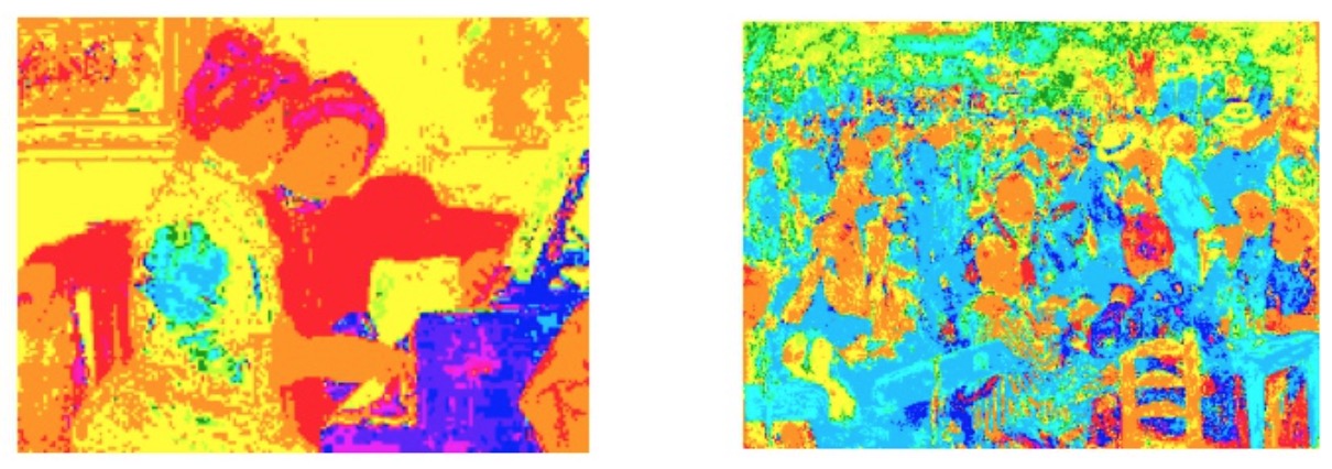
As an example of what this practically means can be seen in the figure above, where “Yvonne et Christine Lerolle au piano” and “Bal du Moulin de la Galette” have been passed through Chamorro-Martínez. The first painting is high in warm hues, the second contains lots of darker ones (dresses, background elements, vegetation).
I have applied this procedure to all the images I had and calculated the percentage of occupation of each of the colours: these numbers constitute what is represented in the card.
Failed attempts
My first attempt to extract the main colours from the images had been running a k-means clustering. The k-means algorithm is a type of unsupervised machine learning technique that aims, given a set of data points, at isolating k (a number chosen at the start) clusters of them such that each point is assigned to the nearest one and the centroid of a cluster represents an average of its member points. It is a way to find patches of points characterised by similar properties and is often employed in image processing to determine a chosen number of dominant colours.
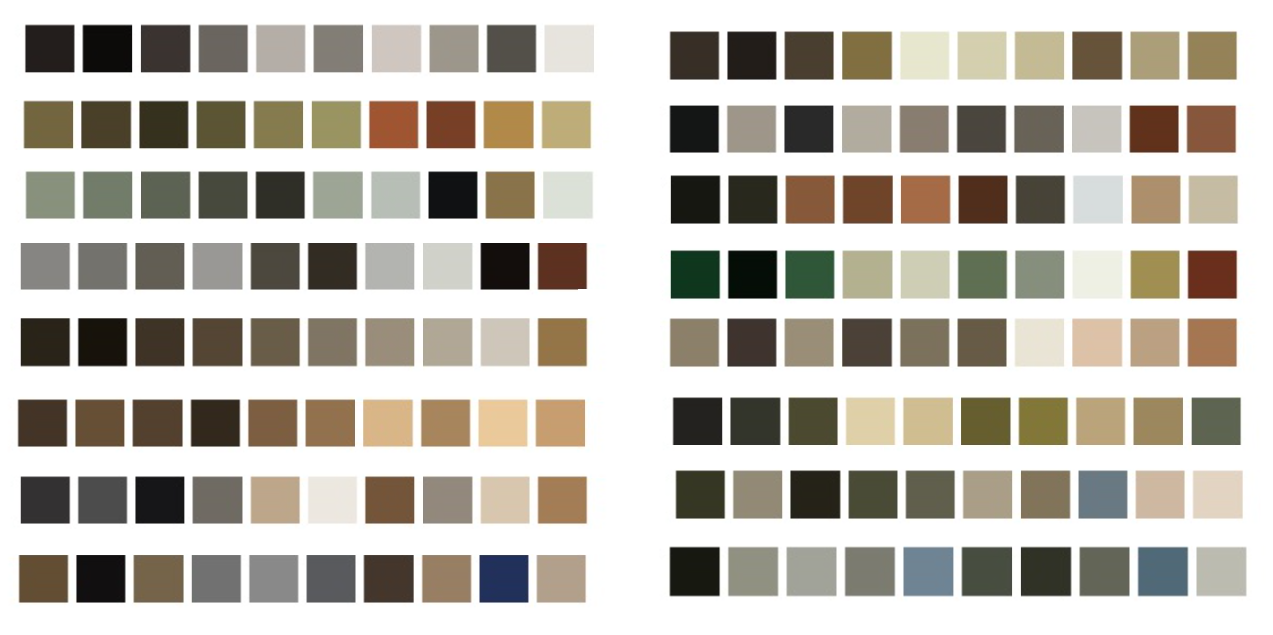
The problem for my goal was that, due to the fact that colours get averaged and the high presence of warm hues, using k-means leads to centroids which are very much in the brown. Furthemore, each painting ends up having different centroids of course, which is not what I needed as it would have been too cumbersome and visually unappealing to represent them. The figure above illustrates this problem.
What I determined I needed was a palette of colours that was appropriate for what I wanted to ascertain from Renoir’s paintings, and a way to map each image pixel to that: this is how I decided to use colour segmentation with a fixed palette. This can be achieved in multiple ways. Initially, I went searching for reliable information on the actual set of colours normally used by Renoir, that is, the paints he actually put on his (physical) palette. This article was educational and I have been thinking about implementing a colour segmentation using the palette specified there. However, I have abandoned the idea because a “Renoir’s palette” is likely something ascertained ex-post from his paintings, so it would have been circular reasoning.
After a bit of research I found a Python library that makes colour segmentation straightforward, and a palette (the Chamorro-Martínez) that seemed adequate for me. I have tried other methods (and palettes) that the library is equipped with, but this one proved to be the most satisfactory.
Weaknesses of the approach
- The images of paintings I used for this work have been extracted from Wikipedia and are good quality files, but being contributed by different users they do not come from the same source, so I am blatantly ignoring all possible variation due to cameras, editing and digital displaying. Had I had pictures of my own from all paintings I wanted to represent, this issue would have been mitigated, but it will take me a bit more travelling to get there!
- The colour palette used in the algorithm, despite being very appropriate at surfacing the colour variety one intuitively sees on the paintings, is still an arbitrary choice that can be improved for applications to art in general and to an artist in particular. In fact, I am pretty sure that the overwhelming presence of orange would be the case for most, if not all, artists I would try this on.
- On the previous point, one could easily refine by choosing a better palette and also potentially excluding from it the background colours to surface the signal better, to see the movement of greens, blues and other colours more clearly.
- The list of paintings used for this is (I think) fairly representative of Renoir’s work, but is still a selection. One could extend this work to all of his production, provided lists of images are available, but this would render a visualisation as it has been conceived here impracticable: the data vizzing part would have to change with more data.
References
All the links I’ve used or referred to in this post, and more.
Art
- List of paintings by Pierre-Auguste Renoir, Wikipedia
- Various lists about Renoir’s paintings, Wikimedia
- Impressionism: Ravel & Debussy, playlist on YouTube
- If Renoir met a pianist at the MET, a YouTube video combining music with Renoir’s paintings
- Renoir, the movie on Rotten Tomatoes
- Debussy, Rêverie, on YouTube
- Sophie Nadeau’s blog, Musée de Montmartre: Renoir’s former home & the oldest house in the 18th
- Renoir’s “Jeunes filles au piano” on Wikipedia
- The colours used by Sargent and Renoir, Jackson’s art
- How to link Renoir to popular movie culture: Mary Poppins country fair scene
Science & Tech
- Chamorro-Martínez J., Medina J.M., Barranco C.D., Galán-Perales E., Soto-Hidalgo J.M., Retrieving images in fuzzy object-relational databases using dominant color descriptors, Fuzzy Sets and Systems, 158:3, 2007
- My Jupyter notebook with the technical work, on Github and on the nbviewer
- colour-segmentation, the Python library I used, with useful documentation on the basics of the algorithms it supports
- K-means clustering on Wikipedia