
Bar charts, so popular, so abused
Bar charts are a very popular way of displaying data, and I’d argue they’re actually too popular - there seems to be a tendency to overuse them, sometimes in lieu of more appropriate ways to represent data. Even in academic circles, some complain that the over-use of bar charts to represent scientific results hides finer-grained information such as the probability distributions underlying the data. In the references below I’m listing a couple of scientific papers that discuss this issue.
Drawing good bar charts
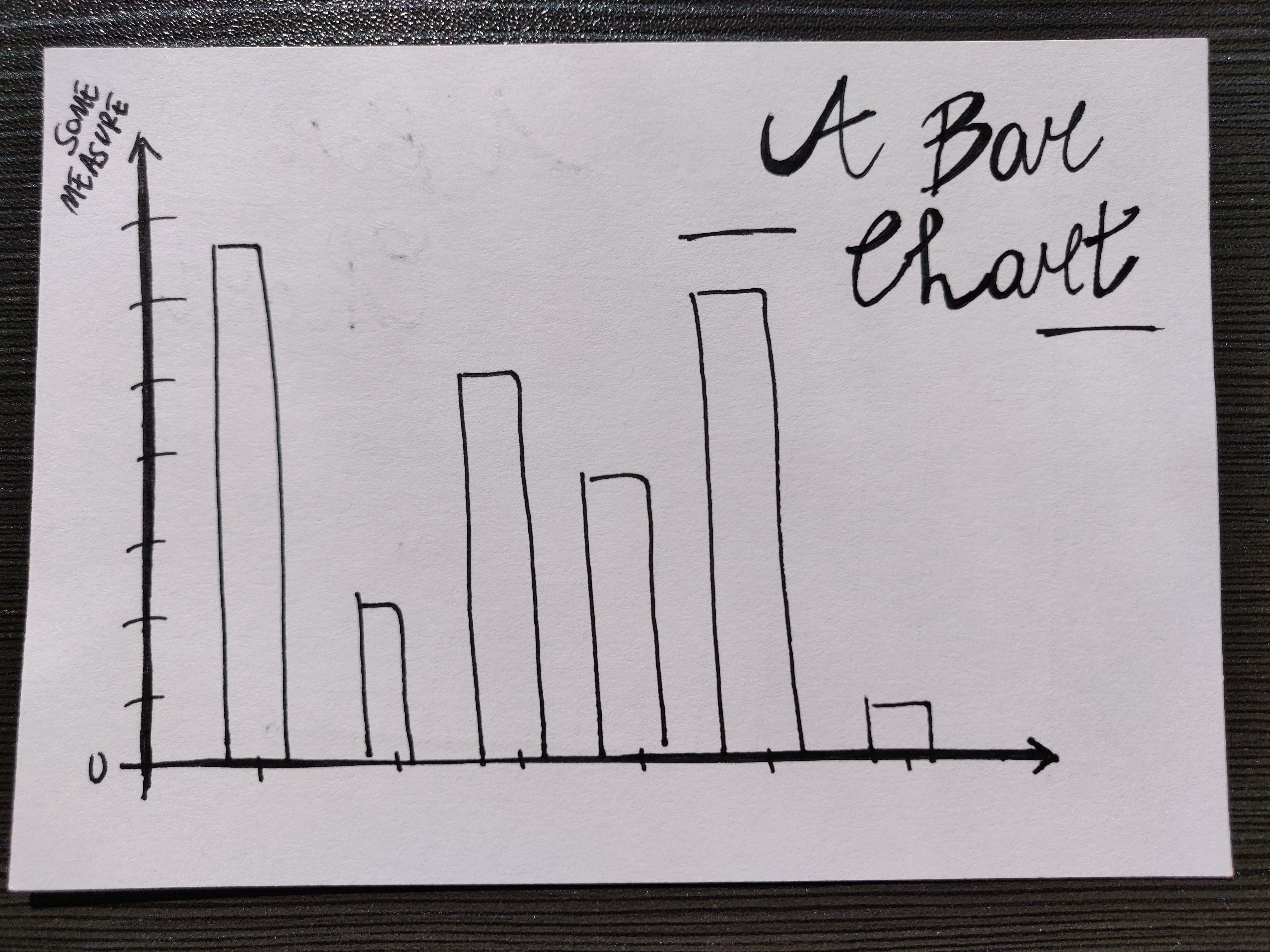
In a bar chart, some measure (this is the data) is expressed on the y-axis and the representation is in the form of “bars”. The chart is meant to show how some measure changes with what is on the x-axis. The x-axis has to host a categorical variable, a category, essentially: examples could be the country (e.g. you’re displaying the median income by country), an age range (e.g. you’re showing the average height of pupils in a school, per each age range), a shape (e.g. you count and display cookies by their shape)…
Start the y-axis from zero
Note: it is good practice to start the y-axis from 0. This is because having a starting value different than 0 may make differences between bars appear larger than they actually are. This guide on Chartio explains this clearly.
Note that bar charts that don’t start at 0 have also been used for deceiving purposes in politics and (bad) journalism. A masterpiece case of this is this one from Fox News, where they showed two different bars on the same chart but one was starting from 0 and the other from a higher value, as an attempt to disparage the Affordable Care Act from the Obama administration.
About a temporal variable on the x-axis
Can you also use a time variable on the x-axis? Yes, provided it is categorised, like this:
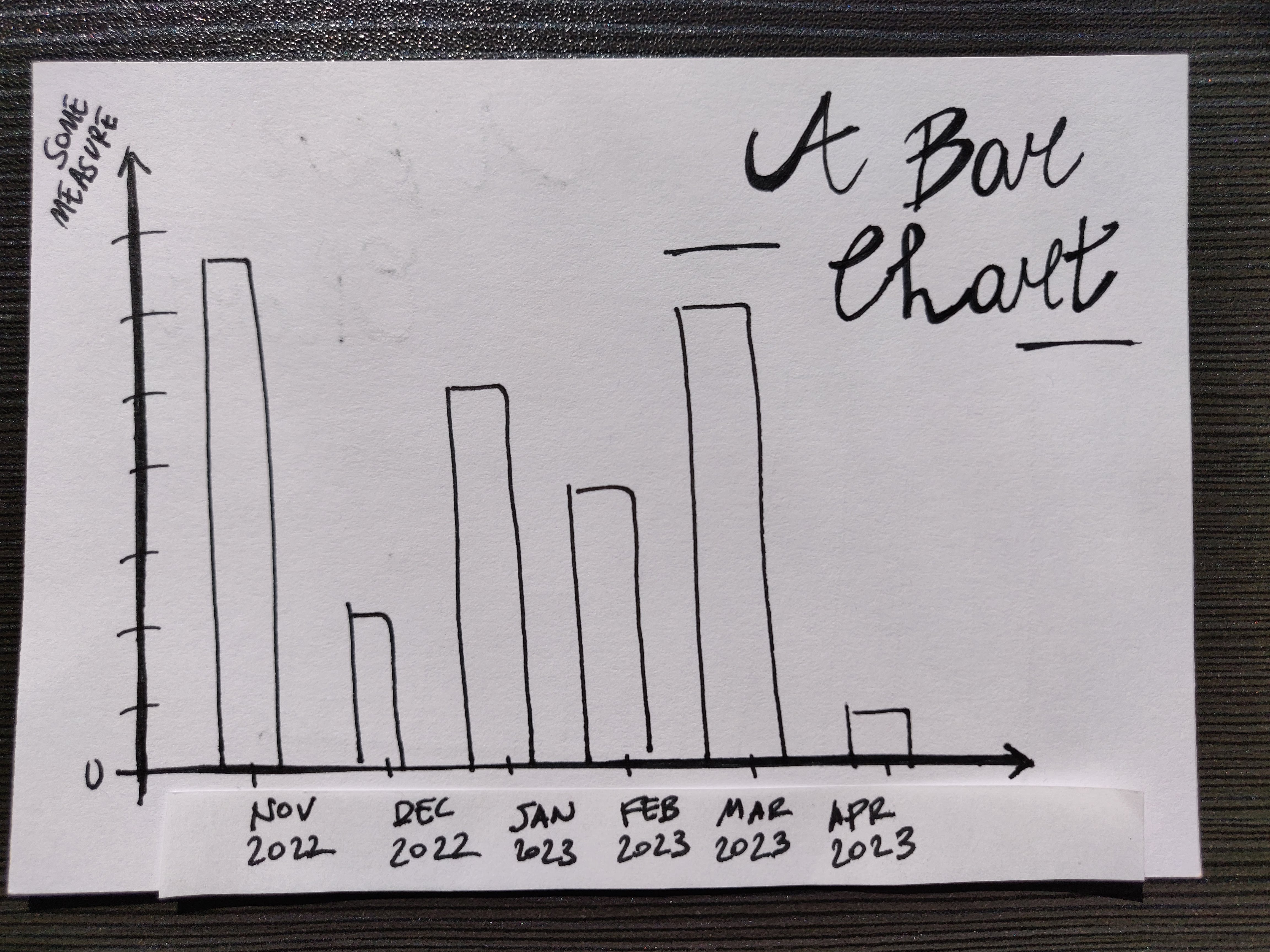
We have shown some measure by month, not by the general time variable (which is continuous): an example could be the millimetres of rain by month of the year. It is just not really possible to display data that changes as a function of a continuous variable by means of a bar chart; not in a good way, at least. For those kinds of jobs line charts are your friends: they allow you to show trends clearly and make the eye “interpolate” values in between points. A good discussion over the use of bar charts for trends is in this post (also in the references).
About colour
Now, let’s add some colour, shall we?
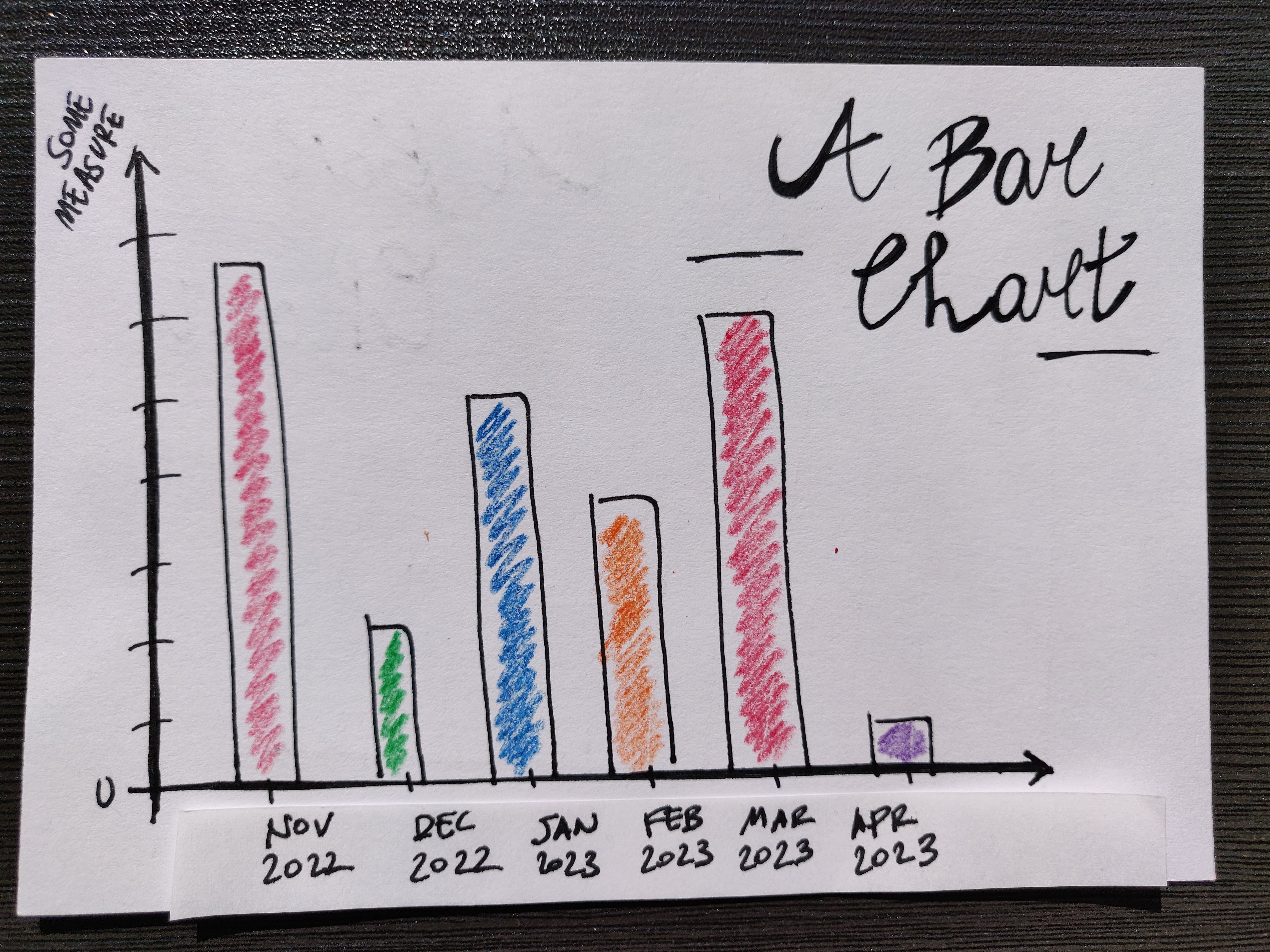
Well, that wasn’t such a great idea, because colour means nothing in the display and is actually pretty confusing. The eye is naturally drawn to look for some kind of legend for the colour-coding, which doesn’t exist. Generally, bar charts should not make use of different colours for the bars. For regular bar charts, it’s nearly always better to choose one hue and stick with it. Colour is of course useful in the case of stacked bar charts, where you need to distinguish two pieces of information.
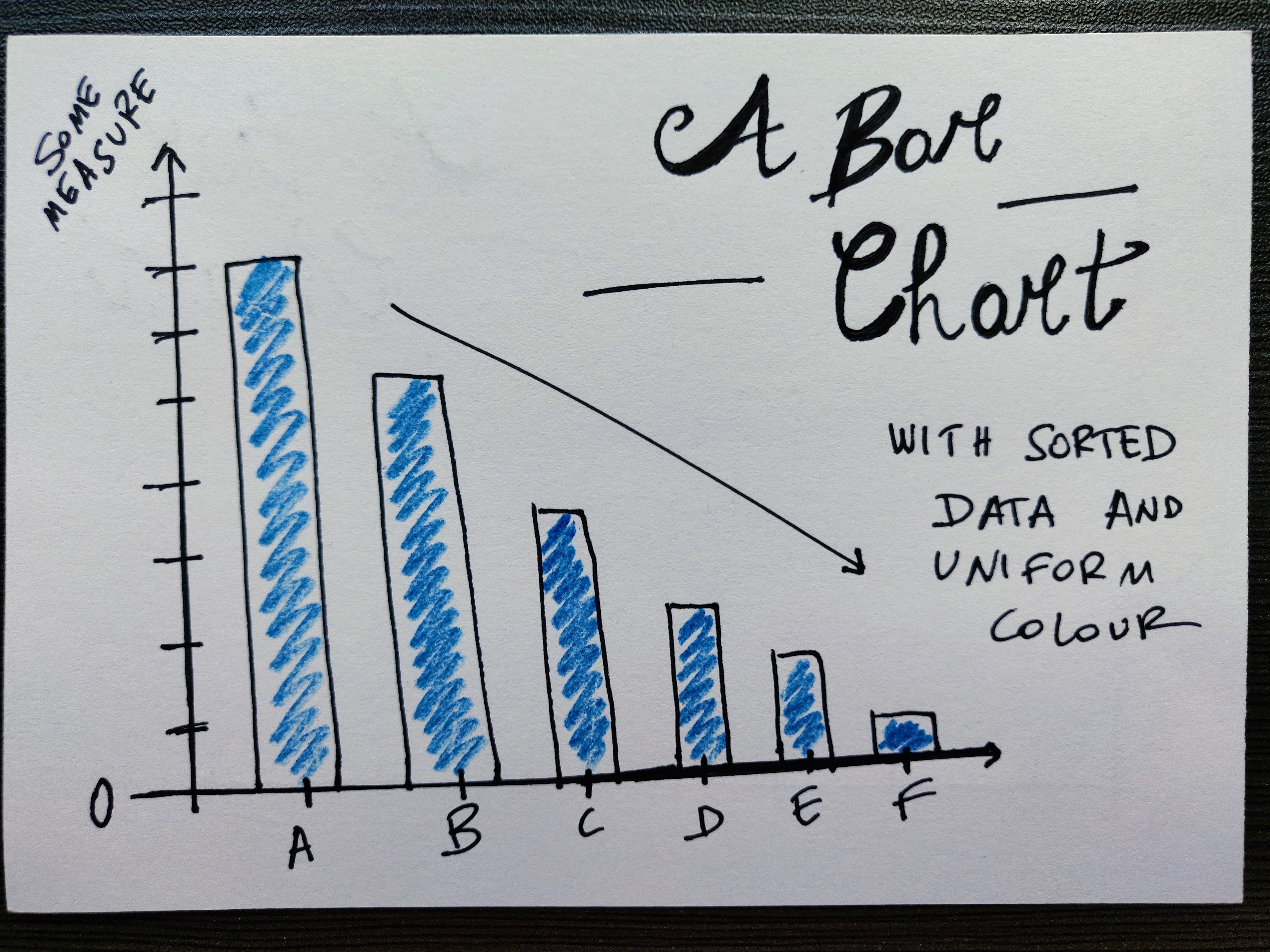
One other thing I’ve done in the above has been sorting the data by decreasing value: sorting (by decreasing or increasing value) can be a powerful thing to guide the eye to quickly grasp the whole range spanned by values.
Now that’s all for now folks!
References
- A complete guide to bar charts, on Chartio
- A Kiebel, Displaying time-series data: stacked bars, area charts or lines… you decide!, VizWiz
- Kick the Bar Chart Habit, Nature Methods, 11 (113), 2014
- T L Weissgerber et al., Beyond Bar and Line Graphs: Time for a New Data Presentation Paradigm, PLOS Biology 13(4), 2015
Oh, I have a newsletter (see link in navigation above), powered by Buttondown, if you want to get things like this and more in your inbox you can subscribe from here, entering your email. It’s free.