
Some Matplotlib idiosyncrasies
Matplotlib, the main data plotting library in Python, is pretty comprehensive in what you can do but not the best in how quick/clear it is to customise your plots to your specific needs. Also, not the best plotting tool available in general in terms of the quality (read beauty) of the end-result, but still, makes stuff come easy and of course, immediately available in a Jupyter notebook, so…
For publication-quality plots (scientific publication), especially if we’re talking about “maths-heavy” ones, I’d always and stubbornly suggest Gnuplot. It’s just beautiful, but it’s typically a pain to get good things done. I have literally spent hours creating the scripts for a plot for a journal article.
Matplotlib is just the thing you use for the regular data visualisation in your everyday life, but it is also very customisable to obtain very nice results. I’m writing this post more as a memento for me about how to achieve stuff. I typically forget Matplotlib’s idiosyncrasies all the time and then what I do is just go to one of the notebooks I have, copy paste the relevant code where I’ve done something, and voilà, food is served. I know it is ugly, but maybe I’m lazy and I’d rather copypaste my code rather than search the docs again because I don’t have a good memory.
This is not meant to be a tutorial and by the way I’ve just discovered there’s two excellent ones here and here. This is literally just me writing down some stuff so I remember better. Maybe it can be useful to someone else as well (?!). Also, I have of course not explored all of the libraries capabilities, yet. For instance, other than the pyplot API, I don’t think I’ve ever used the other parts of it.
It’s usually just a “I need to do this” - I look for docs/examples - I do that process. The following time it goes as “I need to do this, but I’m sure I’ve already done it somewhere” - I look for the example within my code - I copypaste and tweak the code. It’s just an inefficient process.
Let’s see.
Plotting a function with one independent variable
First of all, assuming to have called pyplot and numpy as
import matplotlib.pyplot as plt
import numpy as np
I can plot a sine function as simply as
x = np.linspace(0, 10)
plt.plot(x, np.sin(x), linewidth=2)

plt.title('Sine function', fontweight='bold', fontsize=16)
plt.xlabel('x')
plt.ylabel('sin(x)')
and the result would be
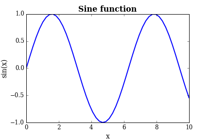
Pretty basic, eh? Not great. Now, from Matplotlib’s version 1.4 on we can have the wonderful ggplot style (borrowed from R), which we can load as
plt.style.use('ggplot')
and the plot changes (for the muuuch better) as
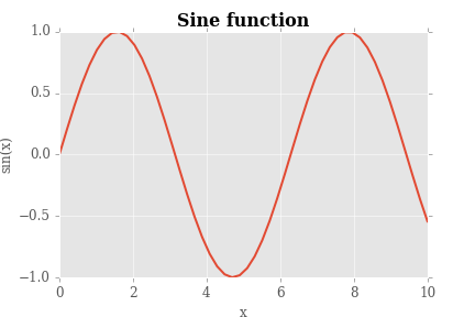
On a quick note, Seaborn, the “statistical” plotting library for Python has the ggplot style loaded by default. We will keep this style from now on. Also note that the ggplot style loads a grid automatically, while in the basic style case we’d have to add it.
Now, obviously we can do lots of tweaks to the aesthetics by changing the colour, the type of line/points, the fonts in the labels, and so on. It would be pretty straightforward from the API. Also, we can do several types of plots as well, such as a bar plot, as scatter plot, and so on.
Plotting a surface
Plotting surfaces is a little more tricky, and this is my example (for a paraboloid centered on the origin):
from matplotlib import cm

x = np.array([i for i in range(-100, 100)])
y = np.array([i for i in range(-100, 100)])
x, y = np.meshgrid(x, y)

def f(x, y):
    return x**2 + y**2

fig = plt.figure()
ax = fig.gca(projection='3d')
parabola = ax.plot_surface(x, y, f(x, y), cmap=cm.RdPu)
plt.xlabel('x')
plt.ylabel('y')
which results in
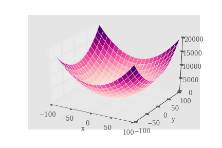
I find this quite nice. You’d have to work a bit on the tics sizes but all in all it’s a good one.
The log scale
One thing I keep forgetting is how to get a log scale on either or both of the axes. It’s simple. An explonential will look like a line on a semilog plot (log on the y axis), so here we go how to get this:
x = np.linspace(0, 1, 100)
plt.semilogy(x, np.exp(x))
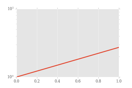
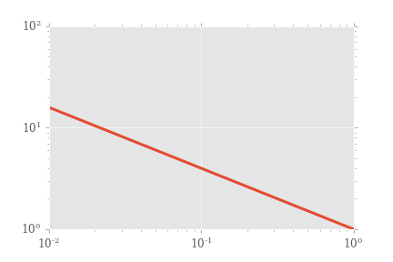
Sure, we could make it look better. Note that a log scale on the x axis is done similarly. Now, a log-log plot (let’s plot a power law so it’ll look like a line) is achieved by
plt.loglog(x, x**(-0.6))
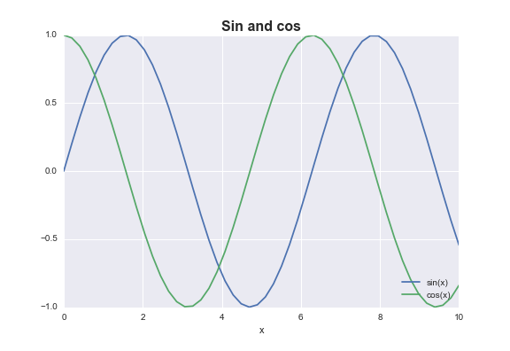
Putting a legend when there are more curves plotted
We need a handler in this case. You can choose where to place the legend, in quadrants (it maybe understands other placement units as well?).
from matplotlib.legend_handler import HandlerLine2D

x = np.linspace(0, 10)
sin_line, = plt.plot(x, np.sin(x), label='sin(x)')
cos_line, = plt.plot(x, np.cos(x), label='cos(x)')
legend = plt.legend(handler_map={line: HandlerLine2D(numpoints=2)}, loc=4)
plt.title('Sin and cos', fontweight='bold', fontsize=16)
plt.xlabel('x')
Obviously this was just a short list of the most compelling difficult-to-remember-how-to-achieve things I’ve found by plotting stuff here and there, not claiming it’s comprehensive.