
Wealth and inequality
In one of my recent posts I mentioned en passant that the distribution of wealth in a population is power law: there’s usually very many people at low incomes and a few extremely rich folks, with not much of a peak in the middle. Basically, the very concept of “middle class” is a bit of a stretch of imagination.
As a follow-up to that, I’ve decided to explore how different countries fare in terms of both their wealth and their inequality. As a matter of fact the two things do not necessarily go hand in hand, you can for instance (and we will see this) have highly wealthy countries with large income differences within the population.
As a measure of wealth, I have used the GDP per capita; as a measure of inequality the Gini index (or coefficient), a classic indicator of income spread in a population - it goes from 0 to 1: the higher it is, the more unequal the population is.
The card
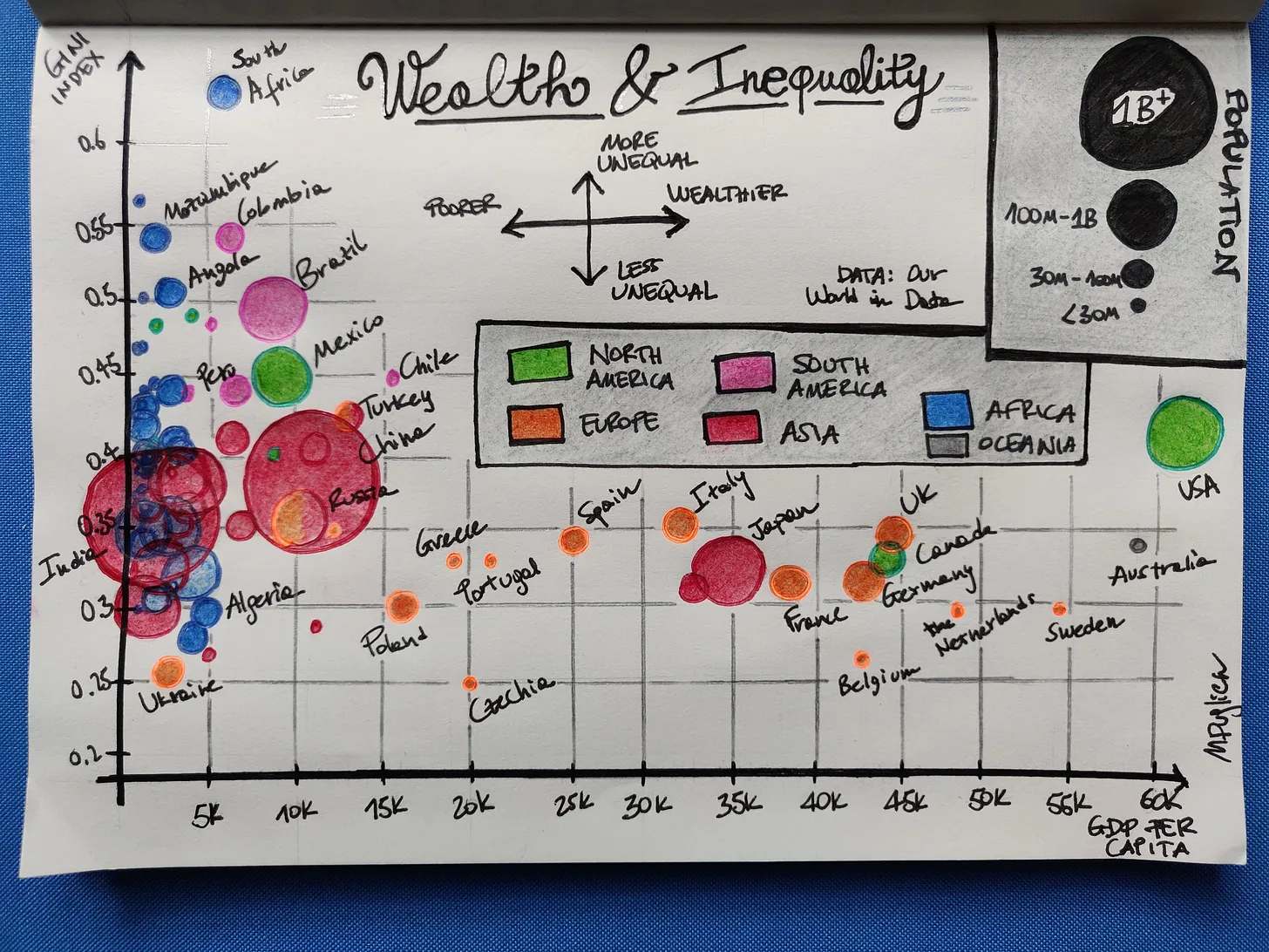
In this scatter plot, I’m displaying the GDP per capita (at constant 2015 US dollars) on the x-axis and the Gini index on the y-axis, a point per country. Points are sized based on their (bucketed) population and coloured based on the continent.
Quick note: the definition of continent is not necessarily standard and has not been in time either - I’ve used the 7-continents convention (North America, South America, Europe, Africa, Asia, Oceania, Antarctica - this last one is of course not represented). Turkey and Russia have been coloured with two hues because they are classed as belonging to both Europe and Asia.
As you can see African countries are in the low-wealth area of the plot, Western countries are quite spread but without representation in the lowest GDP per capita part. No surprises here - note especially the Northern European clique of wealthy/quite equal ones (e.g. the Netherlands, Sweden, Belgium). South Africa is interesting as it has the highest inequality in the lot, an egregious 0.63.
As a rule of thumb, a Gini coefficient above 0.4 represents a significant inequality (this is more of a guideline than a standard divide): the USA are a prominent outlier in the West, with high wealth but also high inequality. I guess this is not particularly surprising either.
Asian countries, where most of the global population resides (see the large balls of China and India), are mostly at low wealth but some like Japan distance themselves from the group.
Oceania is represented by only Australia in the viz, at high wealth of course. South America is mostly in the least fortunate area of the plot.
For a detailed overview of the data used to produce this viz, and caveats, please see the next section. As a general note, you should know that I’ve only displayed countries exceeding the 10 million mark in population (we would have had too many otherwise) and that data points refer to the last year available, which may be different for each country and for each of the three metrics; unfortunately, because of how data is compiled from different sources, we don’t have info updated at the same time for each country.
Details on the data and caveats
The data I’ve used comes directly from Our World in Data, specifically these sources (you can download CSVs):
All three datasets report historical data, meaning there is a row per country per year: I’ve selected the latest year for each country, so as to have the most up-to-date info available. Of course, this implies that not every data point will refer to the same year. Specifically, GDP data spans the years 2015-2021; Gini data spans the years 2003-2021 (a very large range), population data refers all to 2021. This means ignoring temporal changes.
Recommended material
The late Professor Hans Rosling has been an absolute master of presenting data in a way that is engaging, digestible and fun. This here is a pretty famous TED talk he gave in 2006, discussing trends in global development.
He worked a lot in the area of fighting misconceptions we all have about the world, and educating the public on thinking of phenomena under the quantitative lens. The book “Factfulness”, which he co-authored with his son and daughter-in-law is a cult amongst data communities. They also founded the non-profit Gapminder, an organisation devoted to increasing public knowledge on issues of global development. If you head to the website you can test your perception (and likely prejudices) too on a variety of topics.
References
- If you want to checkout the Our World in Data files and the little notebook I did to extract the data used here, here they are
- An explanation of how the Gini coefficient is computed, from Our World in Data
Liked this? I have a newsletter if you want to get things like this and more in your inbox. It’s free.